Livestream Party!
Join us today at 9:00am PT / 12:00pm ET | Details Here.
Join us today at 9:00am PT / 12:00pm ET | Details Here.

 Give a Cheer
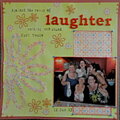
Sketch Callenge - 2 for the Scrap Happenzz Critique Group
No products have been added to this project.


Thanks for spreading positivity!


July 04, 2009
January 17, 2008
November 20, 2007
August 23, 2007
August 14, 2007
August 13, 2007
August 11, 2007
August 09, 2007
August 06, 2007
August 06, 2007
August 06, 2007
August 06, 2007
August 06, 2007
August 06, 2007
August 06, 2007
August 05, 2007
August 05, 2007
August 04, 2007