FREE Standard Shipping on Orders $69+ with code:
FREESHIPPING

Cheers
Give a Cheer

 Give a Cheer
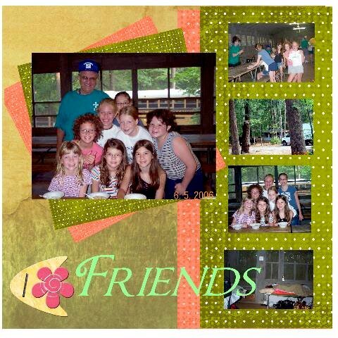
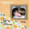
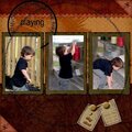
this is a digital layout of dgd at sumer camp
No products have been added to this project.


Thanks for spreading positivity!


July 31, 2006
July 31, 2006
July 31, 2006
July 31, 2006
July 31, 2006
July 31, 2006
July 31, 2006
July 31, 2006
July 31, 2006