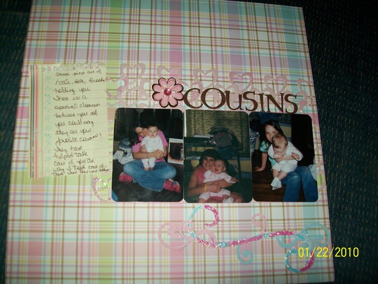
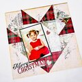
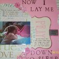
SHCG: What a sweet Lo Margaret! I love the rounded corners on the pics, the colors and all the hearts! I agree with the others about the journaling sheet, it looks a little lost over there, maybe you could move it down some. Great job :)
SHCG: Very pretty colors... I just wish those cute hearts showed up more on the plaid pp. I think Brenda's idea of adding blue glitter would help with that. Sweet girl page! :)
SHCG: I like the softness of this page, both in the color palette as well as the photos. The rounded corners add to that feel, as do the hearts and your journaling. I think if you add blue glitter to some of the hearts, it'd tie that strand with the flourish at the bottom and help make all of your elements seem consistent throughout. Sweet set of pictures.
SHCG - Love this, Margaret! The off-center placement of the pics is visually interesting. Nice how you used fun elements (plaid pp, hearts & glitter swirls) but in soft, beautiful colors to highlight the pics/title more. Those photos are absolutely precious! Dig the sweet handwritten journaling on lined paper. The one thing that I'd note is that the light lined journaling paper kind of disappears for me on that subdued background, so maybe a matte or some chalking around it would help it to stand out. Wonderful overall design. Excellent scrapping!
SHCG: I love your choice of plaid patterned paper here. It looks so very girly. On this page I would suggest taking a wide strip of less busy, but matching paper and running it horizontally across the entire scrapbook page, under your pictures and even under those hearts. This might not even be possible, but I think it would really make those hearts and your photos standout.
SHCG: What a cute page! Love the bg pp and the photos! Also very nice glittery accents with the sparkly hearts and the swirl! The only think that I might do differently is to pull the journaling block a little bit down. Very nice!
SHCG: I like the colors you used for this LO. The glitter at the bottom drew my eye away from the photos a bit. Maybe a dab of glitter on a corner or two of the photos would bring the attention back to the cute photos. Maybe the photo doesn't do this justice and the pink flower above the pictures has enough glitter to it to balance. I like the hearts behind the photos. The journalin strip is cute and matches the color scheme. Nice job.
Does this project or one of it's images contain pornography, profanity, or other illegal or offensive material? If so, please report it and our moderators will come by and clean it up in a flash.

 Give a Cheer


February 12, 2010
February 11, 2010
February 06, 2010
February 03, 2010
February 02, 2010
February 01, 2010
February 01, 2010
February 01, 2010
January 31, 2010
January 31, 2010
January 31, 2010
January 31, 2010
January 30, 2010
January 30, 2010
January 30, 2010
January 30, 2010