%20-%20Scrapbook.com)

Storage & Organization up to 60% OFF!
Plus, a FREE Gift! | Details Here.
Plus, a FREE Gift! | Details Here.


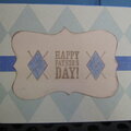
 Give a Cheer
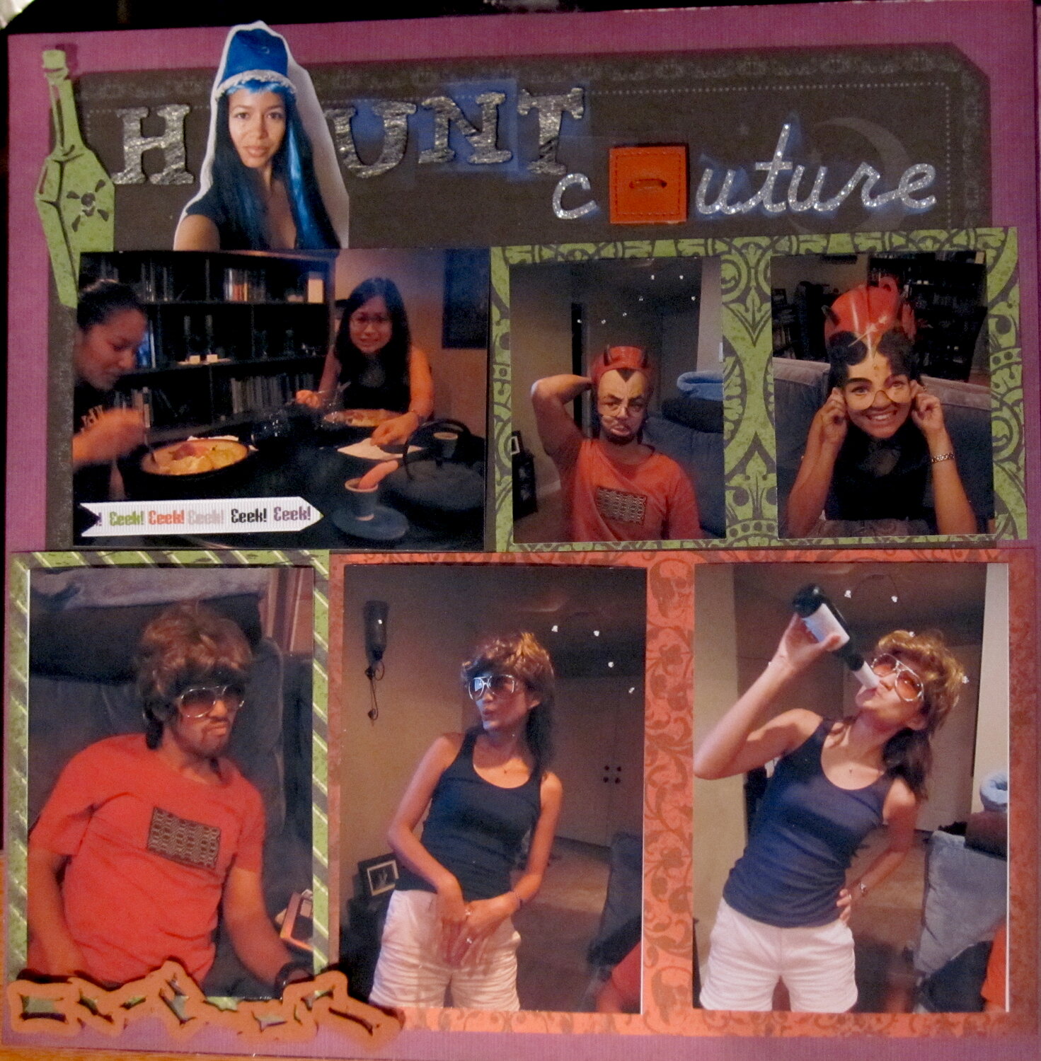
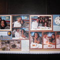
This is for the 2010 SCHG BWC #23 to simply scrap a Halloween lo. Nothing is adhered. I am requesting critiques and suggestions only, at this time please, for this work in progress. I used a pic of myself in place of the A in Haunt, and a square leather button in place of o in couture. I plan on dirtying up the chain link at the bottom to make it look rustier which is why I chose this solid cs color as the base tone, but I need a few tries at it first. When making suggestions please consider its facing page in this two-page spread. Color choices and placement are my main concerns, and if visual triangles are evident across the spread. Thank you.


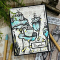
Thanks for spreading positivity!


August 10, 2011
March 02, 2011
December 07, 2010
December 07, 2010
December 02, 2010
December 02, 2010