Oh I do love the rustic feel too! The vellum look so nice on here. I like how you did this. I might not have thought of using those colors together either.
You captured a great rustic feel on this - I'm really diggin the salmon and sage! I'm not used to giving suggestions on LOs but since you're asking...I am also having a hard time reading the title, but since you already cut it, maybe generate the same letters, same font, in a dark brown or darker sage and put them on top of the existing title, so that the salmon is a shadow of a darker, easier to read title? Or ink the existing title as you mentioned. The torn vellum looks fabulous and the brads would be great at that spot. The complementary colors challenge sounds tres cool and yielded great results! Go girl! :o)
For some reason I missed your lo and sorry for that.
I like the colors and the vellum! The photos are great! I think you should use one more of the swirly clips, 3 brads- the spot that you have for the brads is fine.I think the title is a little hard to see.Can you make it using the green pp? I think that may make it stand out a little more. I think you did great job using the salmon and green together!
i'm not going to be much help.. but i cannot read the title.. its very hard. I'd maybe cut dark brown squares to go behind the green ones, or just use a regular font.. not the squares. just very hard to see. The brad idea sounds great.. i like the swirlies too.. maybe you could add a little journaling strip or date or little quotes of things that are said there like "beautiful" "natural" "breathtaking" or something like that.. that the sprial clips are actually holding on kwim? i love the vellum and these colors on this page, love the torn paper.. beautiful pictures.
Brenda, I love your colors. The pics really are prominent and I get that relaxed "waterfall" feeling, especially with your addition of the vellum which is such a nice touch. I agree that your title is hard to see but have no concrete suggestion for it. I think I would have made this a 2-pager featuring the larger pic of the falls by itself and the pics with you and hottie <cough>, I mean hubby, on page two. As for the swirly clips, I always put those things on and then take them back off. I can never decide either so I'm no help there at all. I agree with mel that they don't really add anything, but they don't take away either... (how's that for decisive?) The brads over the dots (what is that? adhesive or something?) is a good idea with the third brad below the 2 dots already there near the pic, not up by the title. Oh, and rather than the striped PP for your mats I think I would have gone with a solid darker green, closer to the color of the trees (which may also be a color for you to consider using to make your title stand out a little more, that or a darker brown). I also think that inking the edges would help!!
The colors are perfect, I can see salmon in the rock and leaves that would have been lost before. Perhaps it shows better IRL, but the title is very hard to read. I would use the colored pencils to shade in the letters, add a third swirly clip, and YES add the DARK green brads, but make it three. 3 pics, 3 swirls, 3 brads - but DON'T put the 3rd swirl on the third pic... group it with the top swirl to off-set
I love those pictures!!! They are amazing. These colors really are great against the photo to. I can read your title at all though, I think brown would work well. I dont think the spirals dont really give anything to the LO, so would be okay to take those off. Than again it could be the placement. Not sure where else to put them though. I love the torn look. I cant wait to read the journaling!
HI brenda .. those photos are amazing! And I like how they take center stage in this layout! Because they should.
I like the torn look and the overall look of this layout but I can't see you title, I think it needs to be revamped. Maybe use darker varieties of the salmon and sage? I like the swirlies too but I would add one more {rule of 3}
I think your journaling be nice!
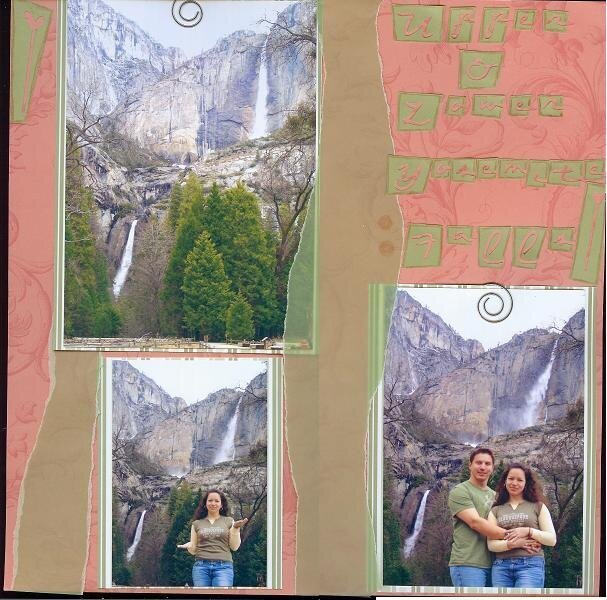
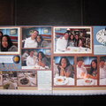
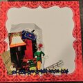
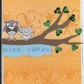
This is my entry for the Complementary Colors SHWC. Had it not been for this challenge, I wouldn't have thought to use salmon and sage together. I probably would've done browns and greens.
I'm planning on journaling down the vellum strip in a dark brown Sakura-type pen. I think the far left of the page could have the date directly written on it as well.
I'm liking the "Opposites Attract" Cricut cartridge. The title is pretty much glued down, but by a crappy glue stick, so I know I have to fix that. After I glued them down, I remembered that I had planned on inking the edges. Instead, I used a light brown colored pencil, but I'm wondering if I should use that same kinda pen.
See where those brown circles are on the vellum, to the left of the "F"? I'm thinking of putting two, slightly darker, green brads there. I'd like to use them. Is this a good spot for them? The mats and pics are very loosely glued down. I'm not sure if I want to use the spiral clips. Anyway, I'm looking forward to your suggestions.
Does this project or one of it's images contain pornography, profanity, or other illegal or offensive material? If so, please report it and our moderators will come by and clean it up in a flash.
March 25, 2007
February 19, 2007
February 17, 2007
February 12, 2007
February 05, 2007
February 05, 2007
February 05, 2007
February 05, 2007
February 05, 2007