Thank YOU! It's Customer Appreciation Week!
EXTRA 11% OFF Orders $100+ With Code: THANKYOU
EXTRA 11% OFF Orders $100+ With Code: THANKYOU

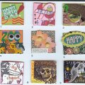
 Give a Cheer
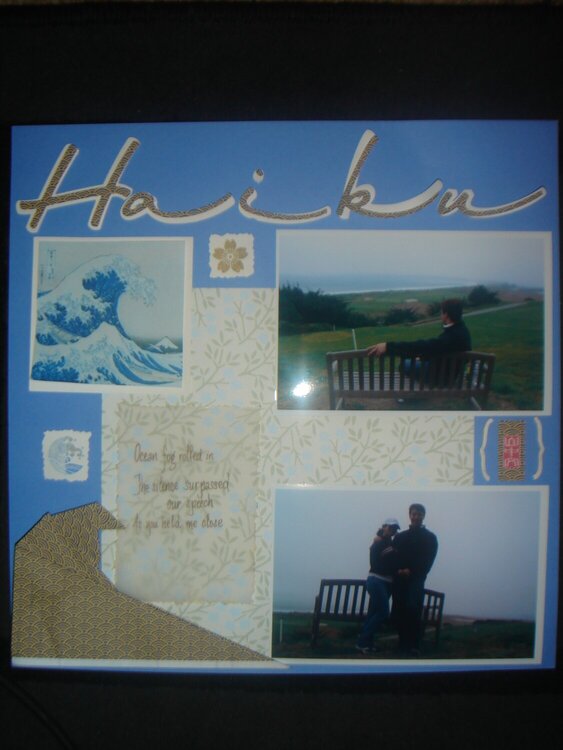
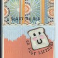
This is for Weeks 16-18 of my "Turning Japanese" SHWC. Bad pic, but I hope you can see the wave pattern in my origami fold and in the title. Vellum and brackets are inked in gold. I wrote the haiku on the vellum. It reads: Ocean fog rolled in/The silence surpassed our speech/As you held me close. "Silence surpasses speech," is a Japanese saying. I included the signature(?) in red that came with the wave pattern, just in case it was giving credit to someone. I also tried to be asymmetrical, as is the Japanese way sometimes (I read somewhere); but, I don't think it translates on my lo. This time I decided not to glue anything down until I read your suggestions, so suggest away.
No products have been added to this project.
Thanks for spreading positivity!


May 26, 2007
May 16, 2007
May 10, 2007
May 09, 2007
May 08, 2007
May 08, 2007
May 08, 2007
May 08, 2007
May 08, 2007
May 08, 2007
May 08, 2007
May 08, 2007
May 07, 2007