

Storage & Organization up to 60% OFF!
Plus, a FREE Gift! | Details Here.
Plus, a FREE Gift! | Details Here.

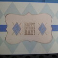
 Give a Cheer
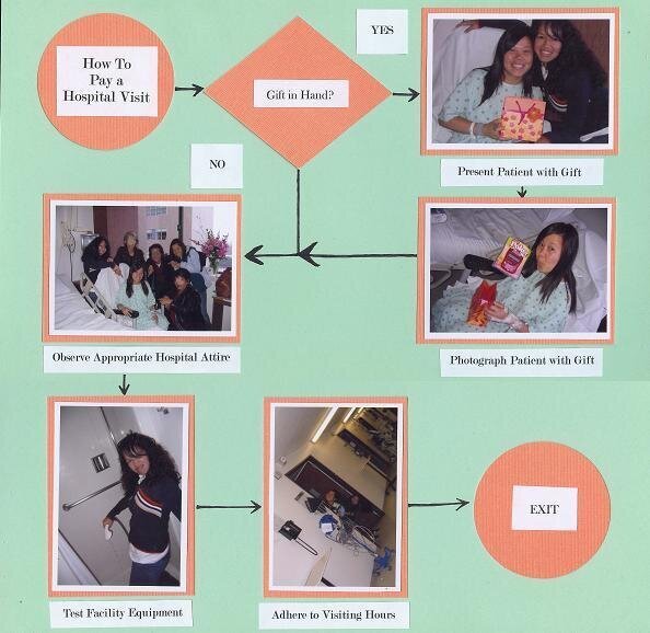
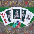
This is for the SHCG Week #22 WC which was to create a lo to enter in the Multi-photo category of the Lucky 7 Contest. As a thank-you, a friend printed out these wallet-sized photos of our post-op visit. I decided to create a silly flow chart with them, and tried to stay true to sterile, technical look with the geometric shapes, arrows, and absence of embellies and patterns. I chose a hospital green cs to match her gown and salmon to complement her gift (a handheld Poker game to enjoy while she was committed to bedrest). The flowchart begins with the title, then opens with an option--Gift in Hand? YES-->Present Patient with Gift-->Photograph Patient with Gift. NO (proceed directly to 3rd step) Observe Appropriate Hospital Attire-->Test Facility Equipment-->Adhere to Visiting Hours-->EXIT


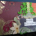
Thanks for spreading positivity!


November 21, 2007
July 04, 2007
June 24, 2007
June 24, 2007
June 21, 2007
June 19, 2007
June 19, 2007
June 18, 2007
June 18, 2007
June 18, 2007
June 18, 2007
June 18, 2007
June 18, 2007
June 18, 2007
June 18, 2007
June 18, 2007
June 18, 2007
June 18, 2007
June 18, 2007