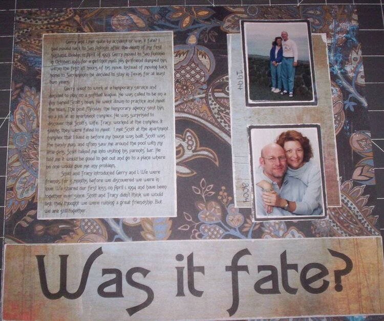
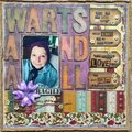
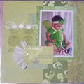
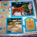
I like this LO and am in love with the pp. I agree that embellishments would be nice and that the two papers need to be tied in with each other somehow. Too much difference between the two.
Thanks bunches!! I always find it hard to add embellishments, I have to get better at them! I also want to learn more about the doodling, I feel that I am not very good at it..
Thanks!!!
I like the layout. I think the title needs something .. it's nicely cut but it's very plain. Maybe some baby blue under it or another color would have been a better choice.
I agree with the others..it may have not won due to no embellishment. I honestly think it doesnt need one. It looks great the way it is, if you were to add something I would just suggest ribbon, a brown or pale blue would look nice. I think the PP, font, and distressing look great together.
I think this is a beautiful layout! I do agree that something, like flowers or a ribbon would have put it on the next level but I think this is very nice and these colors are very appealing to me.
I really like this LO - it's simple and elegant. Robyn and Jessica are probably right that it didn't win because of lack of embellishments - but that doesn't necessarily mean you need them, imo. I think sometimes they are overused, and here I think you did a great job without them.
In the future, maybe a simple photo corner or two on the journaling if you wanted to add something,
I really like this LO, like robyn said it's a little lacking of embellies..I'm not sure exactly what the challenge was at all.. but that could be it. i love that font!!
It's a beautiful LO, lovely PP. It probably didn't win because it's lacking embellishment. I can totally picture some doodling (not funky but more like flourishes) inside of those letters in white. I would have also played up that beautiful "french" blue color in the PP with some ribbon or as a mat behind the pictures or journaling. I also would have done something again at the point where the bottom border meets the PP to soften it up. Again, maybe a strip of ribbon? The contrast between the two PPs is too much and it doesn't "flow" kwim? Actually, you could have reversed the PP and done flourishes by hand in dark brown all over the top, that would've looked cool (at least I think) with your PP and the theme. Oh, and I also see a big french blue flower somewhere... but I'm a flower nut. I love the way you distressed the edges of your papers and the pics.
Does this project or one of it's images contain pornography, profanity, or other illegal or offensive material? If so, please report it and our moderators will come by and clean it up in a flash.


 Give a Cheer


April 04, 2007
April 02, 2007
March 24, 2007
March 18, 2007
March 10, 2007
March 09, 2007
December 29, 2006
December 28, 2006
December 28, 2006
December 28, 2006
December 28, 2006
December 28, 2006
December 28, 2006
December 28, 2006
December 27, 2006
December 27, 2006