Thank YOU! It's Customer Appreciation Week!
EXTRA 11% OFF Orders $100+ With Code: THANKYOU
EXTRA 11% OFF Orders $100+ With Code: THANKYOU

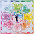
 Give a Cheer
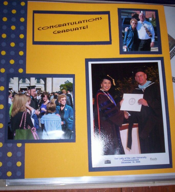
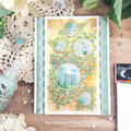
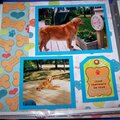
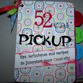
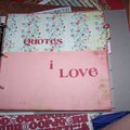
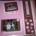
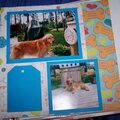
2007 layouts
No products have been added to this project.

Thanks for spreading positivity!


March 10, 2007
January 10, 2007
January 10, 2007
January 10, 2007
January 10, 2007
January 10, 2007
January 09, 2007
January 09, 2007
January 09, 2007