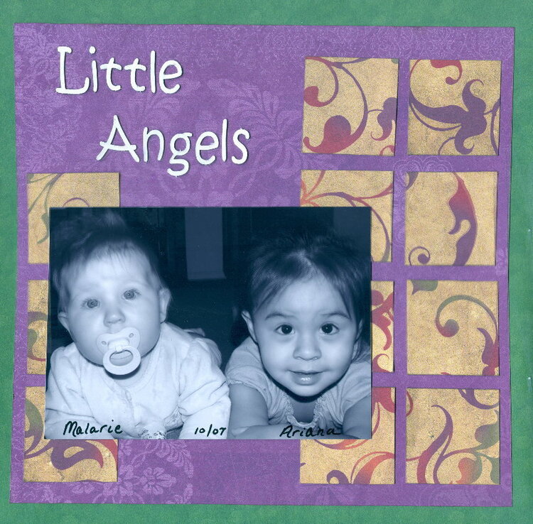
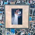
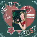
SHCG: I'm gonna try a different critique approach than the rest of the group and work with the simplicity of the page. First off, great photo! I like how the purple pp picks up on the photo tint. Funny, your handwriting kinda looks like the title font. I'd think I'd like to see golden hues on the title, though, and maybe even a halo placed slightly askew around the A. Instead of a mat, I'd suggest photo corners, maybe fancy scroll ones, like Moi's punches, just to go along with floral flourishes in your pp. I like those squares, and I can see two strips coming out the right side of the photo, extending over to the second and third squares of the rightmost column. The top strip is shorter than the other and has Malarie's age in months written on it; the bottom is longer and reflects Ariana's age. Sorry about the nine day delay on my critique.
SHCG: Fabulous photo (LUV the B&W) and fabulous choice of papers. Really like how simple the layout is but it would be interesting to see how it would look if the photo was matted.
SHCG: Beautiful picture and I love your choice of colors. I think a white photo mat would be a wonderful addition to add behind your picture. I think it would really draw out your title. I love Melissa's idea of the angel wings. I found some white rubons that were distributed by Hambly Studios. I think it would also be cute to add something to each of the four squares on the right side. Maybe some large baby shaped brads...
SHCG: Christy, they are sooooooo adorable! I love this photo and their bright eyes looking right toward us. Perfect! I love the squares and agree that moving the title down a bit would look nice. I would like to see a white photo mount on the photo to coordinate with the title. Also, (and I think this is because of my askew personality) I'd like to see the photo tilted up on the right a bit just to be in the face of all of the perfectly placed squares. Dovetailing off of Melissa's suggestion, I saw a layout. I will try to remember where, where the person had added rub-on angel wings to a picture. They actually came "out" of the photo onto the layout and look wayyyyyyy cool. I think that might look nice here. However, the picture totally carries this layout and it is fabulous! Great job.
SHCG - They are so cute!! Lovely soothing colors & beautiful pp. (I was thinking of doing a similar squares PP LO for your WC!) I think a little more emphasis on the photo would be nice - maybe a double matte of any combo of: the outer green, the white from the title or the pp (but if the pp, have an outer matte after that to discern from the background squares). I also think the previous critiques give you some gread ideas to ponder. Beautiful job Christy!
SHCG: First off, they are adorable! I like your color choices here. They are calm and sweet and definately give an angel vibe. I really like how simple it is and love what you were going for, however I feel like it needs something. I was thinking angel wings made out vellum behind the title.
SHCG: look how cute they are!!! I really like the colors you used here. I agree wtih nitza about moving the title down. It would complete the square of where there is no pp squares and sort of finish it. This is a very cute, simple LO. looks great!
SHCG: Christy, those two are so cute! Love the colors that you used here!The swirly pp is very pretty and just right for the girls! I would love to see the photo pulled down a little bit so the pp is the same size all around it. Also, may be put the " angles" in between the pp just above the photo and and " Little" starting from the left of the pp ( the swirly one) , just above it.Budda belly is growing fast!
Does this project or one of it's images contain pornography, profanity, or other illegal or offensive material? If so, please report it and our moderators will come by and clean it up in a flash.


 Give a Cheer


April 12, 2008
April 06, 2008
January 18, 2008
January 18, 2008
January 12, 2008
January 11, 2008
January 08, 2008
January 07, 2008
January 04, 2008
January 04, 2008
January 04, 2008
January 04, 2008
January 03, 2008
January 03, 2008