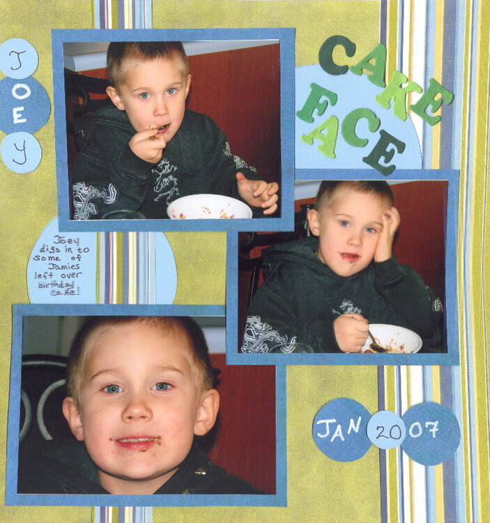
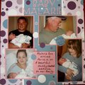
How sweet is he! Love the colours on this page and the circle. I dont really like that the 2007 is over 2 circles i think it would be better on one. I really like the stripped bit of paper too!
I think you have a nice start on this. I would like to see the title stand out a little more. I would mat it or doodle around the edges. I love the stripes though, they look awesome.
Great job! I'll agree about the different colored writing. The difference in thickness takes away from it a bit and definately makes the date seem like January 20th.
i do love how you put his name and the date, but maybe try to put 2007 all together on one circle that is like bigger or littler that the Jan one, either way, make sure its on the same circle just so its not confusing. i love the colors on this LO and i really love that ribbon.
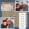
Great colors Christy. I love the blue and green look and I like the way you staggered the photos. I would put something where the photos meet. A circle, a brad, photo corners, ribbon, anything!
Great LO! I like the colors and the photos! I also like how you change the fonts on the name and the date! Only thing I'll do is to put the title horizontally and on top of the blue circle.See, you can stay away from flowers.Great job!
Not loving the changing of pens in the same word - mostly b/c they aren't the same width, I think. Thicker black or all one color, would be more appealing to me (taste issue? c/b just me on this one) I would also consider sliding the circles with name and date until they over lap edge of nearest photo - name over to right, date up to middle pic.
I love the extreme closeup and would swap that with the middle pic for more punch. The other 2 are so much alike, I think breaking them up would add something.
Like the colors/papers again - nice choices.
He's a doll.
All I wanna know is... where is your time machine? I wanna hop to January 20th too and get the lottery numbers for Januray 15th (tomorrow). But seriously... Like all of the colors and the way you slipped that circle behind the striped pp for your journaling but I would have made it bigger so that you don't have the little green square of pp showing in between all three squares (see it beside the journaling there? Also a unique way to add his name and the date. I would have kept the circle up in the top/right but I would have placed the title completely horizontally, not at an angle, especially since nothing else on the page is angled. Another nice "boy" page though and no flowers!!
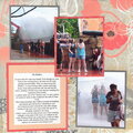
I like the colors. However, I don't see a "focal" point. The eyes are not drawn to any particular photo. If you can't enlarge one photo, how about creating the effect by double or triple matting your favorite. Also matting or inking the letters to make them "pop".
Honest, Contructive, Critiques - no hard feelings we all know that "Scrap Happenz!"
Does this project or one of it's images contain pornography, profanity, or other illegal or offensive material? If so, please report it and our moderators will come by and clean it up in a flash.


 Give a Cheer


July 06, 2007
April 22, 2007
April 21, 2007
January 22, 2007
January 17, 2007
January 16, 2007
January 15, 2007
January 15, 2007
January 15, 2007
January 15, 2007
January 14, 2007
January 14, 2007
January 14, 2007
January 14, 2007