Thank YOU! It's Customer Appreciation Week!
EXTRA 11% OFF Orders $100+ With Code: THANKYOU
EXTRA 11% OFF Orders $100+ With Code: THANKYOU

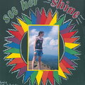
 Give a Cheer
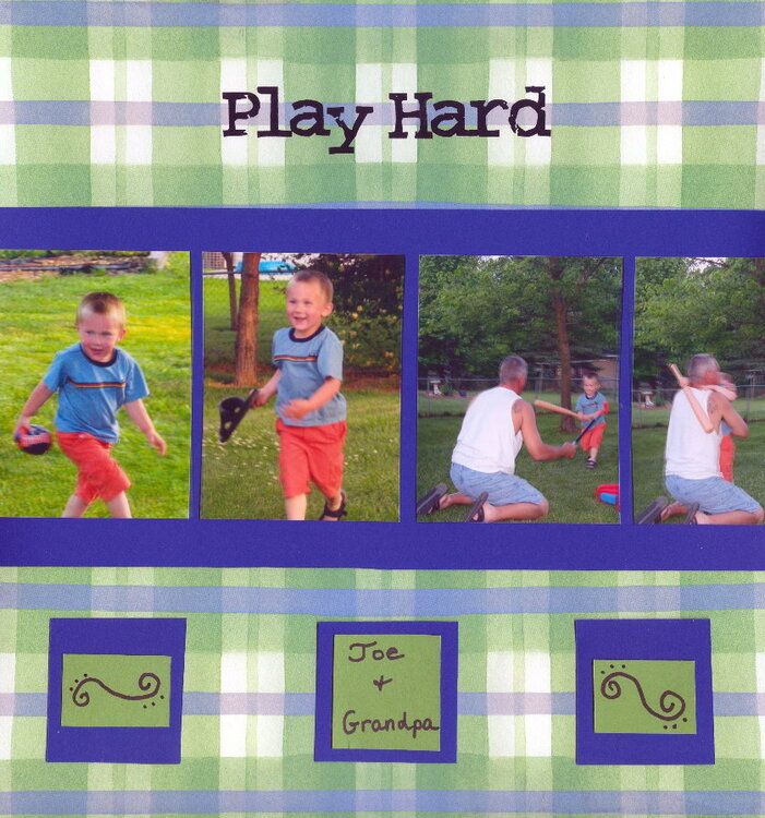
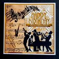
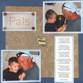
Not a great scan, everything is linear irl. My DH and grandson Joe
No products have been added to this project.

Thanks for spreading positivity!


July 02, 2007
April 23, 2007
April 15, 2007
April 13, 2007
April 13, 2007
April 12, 2007
April 12, 2007
April 12, 2007
April 12, 2007
April 12, 2007
April 11, 2007
April 11, 2007