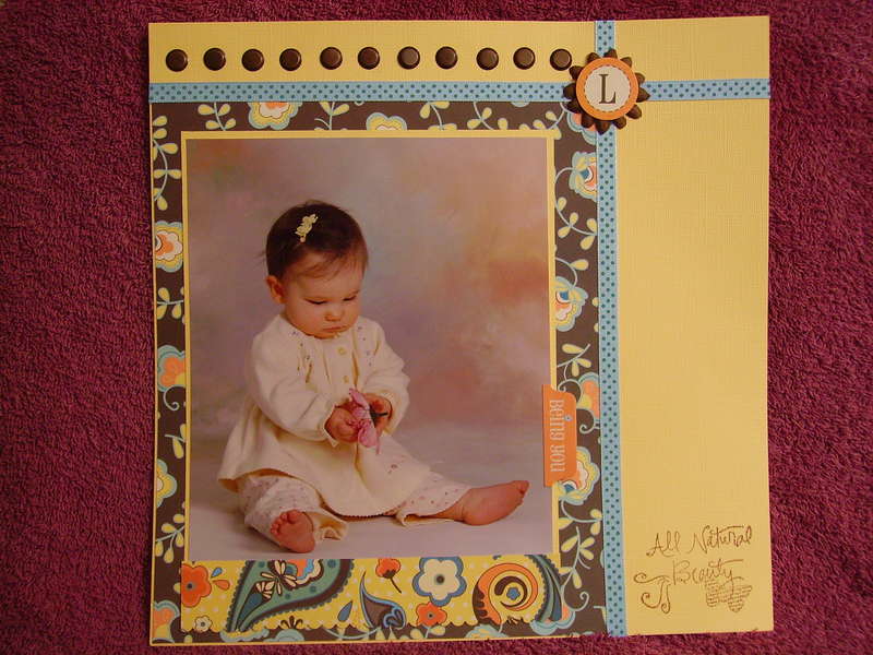
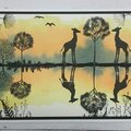
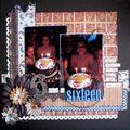
This is beautiful! I love the mix of colors and patterns that you used! I do think the title needs to stand out a little more. If not framed, then stamped in a darker color.
I think the stamped words seem too small and maybe need to be emphasized with a frame or journaling block. It's a beautiful photo and I love the papers and colors you've chosen! It just needs to be a bit more balanced in the lower right corner.
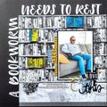
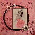
Beautiful! I'm in total agreement with the brads going down vertically and maybe some journaling down the side telling where she's at in her growth process. I think it is beautiful! And I love the Being You embellie.
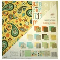
I agree with the brads idea. Continuing that visual theme would balance the page a bit more. But even without it, this is a delightful page. I love the brown pp!! I love even more the coordinating yellow pp matte... the laters of texture are so pretty!! And the brads are fab!!
I LOVE this lo and think it's fine the way it simple, so simple and sweet. If anything I agree with the brads going vertically down the side or a photo corner on the bottom left side of the pic. Great job!
It's a beautiful LO. Your daughter is so cute! My suggestion is to continue the stretch of copper brads on the right side of the vertical ribbon to balance everything. But maybe someone will have a better suggestion. Finally, I really like the stamping that you did at the bottom right corner. It describe the subject perfectly. :) Great job!
Does this project or one of it's images contain pornography, profanity, or other illegal or offensive material? If so, please report it and our moderators will come by and clean it up in a flash.


 Give a Cheer


March 10, 2007
March 08, 2007
March 07, 2007
March 07, 2007
March 06, 2007
March 06, 2007
March 06, 2007
March 06, 2007
March 06, 2007
March 06, 2007
March 06, 2007
March 06, 2007
March 06, 2007