LOL you certainly got the funny photo spot on. I like the matt you've used for the journaling, very snazzy. The title looks very interesting with the main word done in different letters with the smaller words after it, and the flowers in between are very cute. Plus the buttons in the flowing style at the bottom give it a fun feel also.
PS. still laughing.
Very funny and cute and full of life. I love that these are atypical wedding photos using colors that are also not commonly associated with wedding albums. I like your photo placement, especially how the bride and groom's individual photos flank the middle with the most people in it. The buttons--whenever someone puts buttons on a page, my first reaction is usually to question what they have to do with the subject. In this case, the colors, the wave, are great. They don't have to do with weddings or chickens. They are embellies... except that they do add to the whimsy of this page, so they don't bug me here. You made them work. My only critique has to do with the "like no one is watching" section. I think it would have a smoother flow with the flowers going in a diagonal in the opposite direction and the strips moved accordingly. As is, the reading is choppy to me.
Now, why did MY DJ not dress in a chicken suit? EVERY DJ should do this! What I LOVE is that you don't make any use of "na na na na" *anywhere* on here but, of course, every one who sees this will immediately sing that song whether they *want to* or not! Evil, evil, evil! 100% fab design.
This is oh so fun...love how these bright colors defy the stereotyope of wedding colors (pastels-o-rama). The pp is sensational, flowers, chipboard & buttons adorable, photos are hilarious! I like how the photos are placed but to echo Tiff & Jess, I would've liked to have seen some angling in the placement of the pp flowers, rather than having them lined up next to each other. What a feel-good, festive page!
OMG. OMG. OMG. I love this. I love the foundation of primary colors, the pictures are absolutely hilarious, and I love the title. It made me laugh out loud, chicky (oops, sorry). I love it all, the only thing that I would suggest is moving the first (left) flower under the journaling up a smidge. Lemme see if I can explain.... So that the top left corner of the block is the center of the left flower and the bottom right corner is the center for the right flower. I think it would create more flow and would complement those fantastic buttons at the bottom. However, having suggested that, I love everything about this. Super job, Jenn. P.S. Thanks for putting that song in my head. na na na na na na na *clap* *clap* *clap*
I love your photo and title placements, and those buttons on the bottom. I think, with those two paper flowers under that journaling box, I would put the two of the together on the left hand side (a little overlapping) and then the journaling block halfway on them. Then, with the journaling bits I would take the flowers out of the middle and move them a little towards each other, and have the three flowers on the right at the end of each row. I really love this pp, and those pictures are too funny!
Hi Jen .. I love your photo placement and the story told in this layout. Soo much fun. I love the pink and blue paired with that yellow in the photos. Your title draws so much attention. I have no suggestions, this is great!
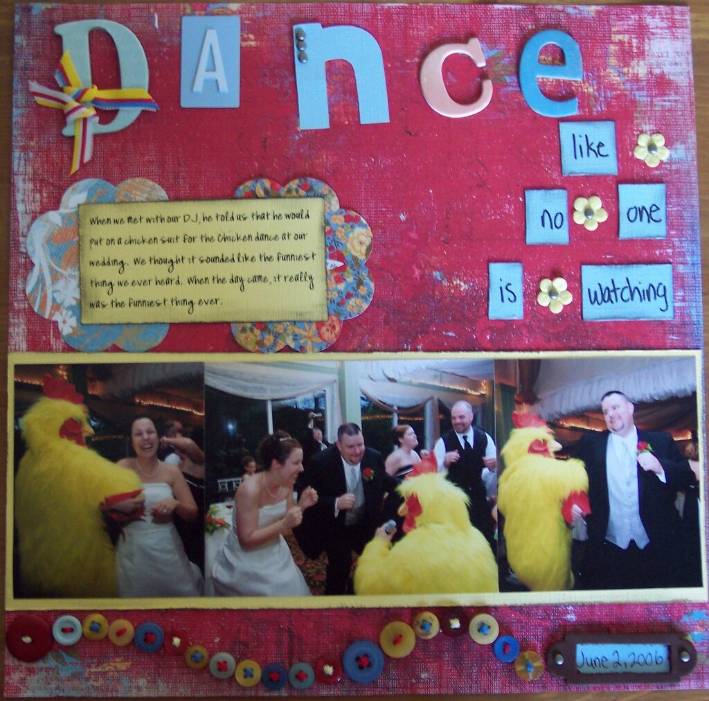
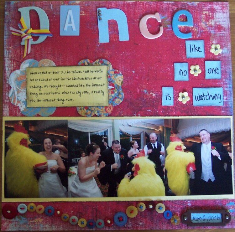
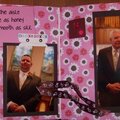
This is a layout of my husband and I on our wedding day. The journaling reads..."When we met with our DJ, he told us that he would put on a chicken suit for the chicken dance at our wedding. We thought it sounded like the funniest thing we had ever heard. When the day came, it really was the funniest thing ever."
Does this project or one of it's images contain pornography, profanity, or other illegal or offensive material? If so, please report it and our moderators will come by and clean it up in a flash.
July 31, 2007
July 30, 2007
July 24, 2007
July 24, 2007
July 22, 2007
July 22, 2007
July 22, 2007
July 20, 2007
July 20, 2007
July 19, 2007
July 19, 2007
July 19, 2007
July 19, 2007