SHCG I think I'm definately going to have to lift this one! Its the perfect multi photo layout for an event like xmas. Love the way you have done this!
SHCG: Jen, this is fantastic. Number one it is fantastic that I am not the only one still scrapping 2007, and number two it is just a fantastic layout! I did a layout similar to this regarding my son's third grade year (if you are ever board, look it up in my gallery), the thing that I remember most about that layout was painstakingly placing the non-photo squares of paper. It took me forever! Anyways, I think you did a super job here and I love the colors, the composition, and the photos that you used. I do have to agree with the others about possibly moving that red square, but honestly....it doesn't bug me too terribly. I adore the vertical title and your journaling is superb. Very nice layout, Jen!
SHCG: What a fun page. All of the photos are so interesting and your layout is a great way to get lot of photos on a two page spread. LUV the Christmas accents. Not sure about only the red going outside your grid. I would tend to have made it fit within the grid.
SHCG: The clean and simple approach is sometimes the most effective and efficient way to get those scrafty obligations done, especially when you have multiple pics. This is no exception. My only suggestion is to change that red square, because my eyes are automatically drawn to it since the negative space is in the top center of your spread. I can see it broken up into alternating red and green one inch squares. I'm also wondering how it would look if it switched places with the photo directly underneath it. You have three rows of pics, and doing this would create symmetry between the top and bottom rows. Great spread, Jen. I really need to take this approach more often.
SHCG: I love this also! All the pics are awesome, love the white borders, the set-up is great and the ribbon on each end is nice. I didn't notice the red block either, I'd leave it as is. Great job :)
SHCG - I freakin LOVE this - the multiple pics, descriptive journaling, clean grid design - awesome job! Excellent collection of images capturing these great family moments. I see what the comments below are saying re: that solid red square & I agree but honestly, I didn't notice it until I read about it. Brilliant 2 pager!
shcg: Wonderfully clean LO. Great way to include all of those pics and journaling. I, too, tend to agree that the blank red square in the top row is ill-fitting and another square of the pp would be better suited to finish out the design. Great job with those holly leaves!
SHCG: This is super. I'm never good with multi-pic LO's, but you pulled this one off!! My only suggestion is to replace the red square with the patterned paper for overall consistency. Great job!!
SHCG: I really like the grid. Very interesting LO. My eye is drawn to the one blank square... I wonder what it would look like if you put in a strip of the border ribbon, cutting it two 3/4 of the way down the square. Just a thought. Great photos.
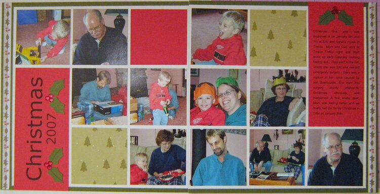
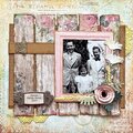
My family Christmas 2007 (it actually took place January 2008). This page has been in pieces in my work-in-progress folder for ages - I was reading one of Cathy Zielske's Clean and Simple books when I started it, which inspired all the squares and straight lines. I finally decided this weekend that I needed to finish it.
The title and journaling were printed from the computer, the holly leaves were hand drawn/cut and the berries are red rhinestones.
Sorry to Sarah for posting a pic of her in a paper crown :).
Does this project or one of it's images contain pornography, profanity, or other illegal or offensive material? If so, please report it and our moderators will come by and clean it up in a flash.
March 13, 2009
March 01, 2009
February 20, 2009
February 19, 2009
February 03, 2009
February 01, 2009
January 26, 2009
January 25, 2009
January 21, 2009
January 21, 2009
January 20, 2009
January 20, 2009
January 20, 2009