

FREE Standard Shipping on Orders $69+ with code:
FREESHIPPING
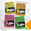
 Give a Cheer
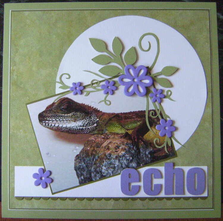
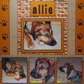
My Chinese Water Dragon, Echo. The design was inspired by Beggahuna's swirlydoo's sketch (http://www.scrapbook.com/galleries/101207/view/2132849/-1/0/1.html).
The flowers, large petals and letters are chipboard and the vines along the edges of the photo were cut from a print-out of the sketch. The scalloped edge is made of punched circles. I couldn't decide on a good place to include the date, so right now it's just written on the back of the LO.


Thanks for spreading positivity!


May 30, 2009
May 28, 2009
May 27, 2009
May 24, 2009
May 22, 2009
May 18, 2009
May 18, 2009
May 18, 2009
May 18, 2009
May 17, 2009
May 17, 2009
May 17, 2009
May 17, 2009
May 17, 2009
May 17, 2009