SHCG: Awesome job on cutting the branches and lettering. Love the colors in this LO. The Circle is great, and I love the fact you were able to place the title on it. A possibility for the circle would be to move it a bit closer to the photo so the upper left corner either almost touches it or overlaps just a bit. Nicely done. Great photo too!
SHCG: This is so beautiful! I like the big white circle, I would take the small one off the picture and add 09 on the other circle. Love your branches, great job :)
shcg: beautiful photo! I agree the one circle seems a bit off but maybe having a second one would help as previously suggested. i do like how it's used for titling though!
SHCG: I love how you used a cut out photo as an embellishment! I really like the white ring with the title on it, but the circle with the date seems lost to me. Maybe Denitza's suggestion of another circle would help it fit in?? Beautiful LO as is though!
SHCG: Awesome page for the zoo book! Love, love the photo! Also great idea to cut out the little bird! I love the hand cut branches and leaves! The punched flowers are so very nice! Love the title too! I think the white circles are just right here-they go just great with the white feathers. I think another small white circle above the year one will look great, but I don't know what to suggest you put on the circle. Great lo and great photo!
SHCG - Outstanding LO! Is this another page from your zoo book? I LOVE the handcut leave & branches, the punched/Stickled flowers are terrific. Excellent overall placement & color choices. The white circles work for me because they echo the white on the bird. The small photo bird in the branches is a clever touch. Since I like things in 3's ("they" say that's more pleasing design-wise, which I mostly, but not always, agree w/), I could see adding a 3rd bird, another little photo bird in the top branches. Regardless, sensational LO as is already! TFS,
SHCG: First, this is a beautiful bird photograph. I also think all of the hand-cutting work you did was amazing. It is so time consuming and I appreciate that when I see it. I do agree with Brenda's suggestion on the white circle. I think ink would help it all blend together. I am also going to suggest that you add some journaling. I am curious as to why you made a scrapbook page for the Eastern Meadowlark and am left wondering if there is a story behind this photograph.
SHCG: You did such a precise job cutting out the font. Great shot of the bird, and I love that you cut the smaller bird out of another photo. Great idea! The purplish hues to the branches are such a nice complement to the cute yellow flowers. I'm thinking maybe the white ring might be too neutral for you and that may be why you're not sure about it. I couldn't think of a better color, so how about just inking the edges in yellow to further complement the purple title. Looks like a simple page, but you put a lot of work into it. Very nice work.
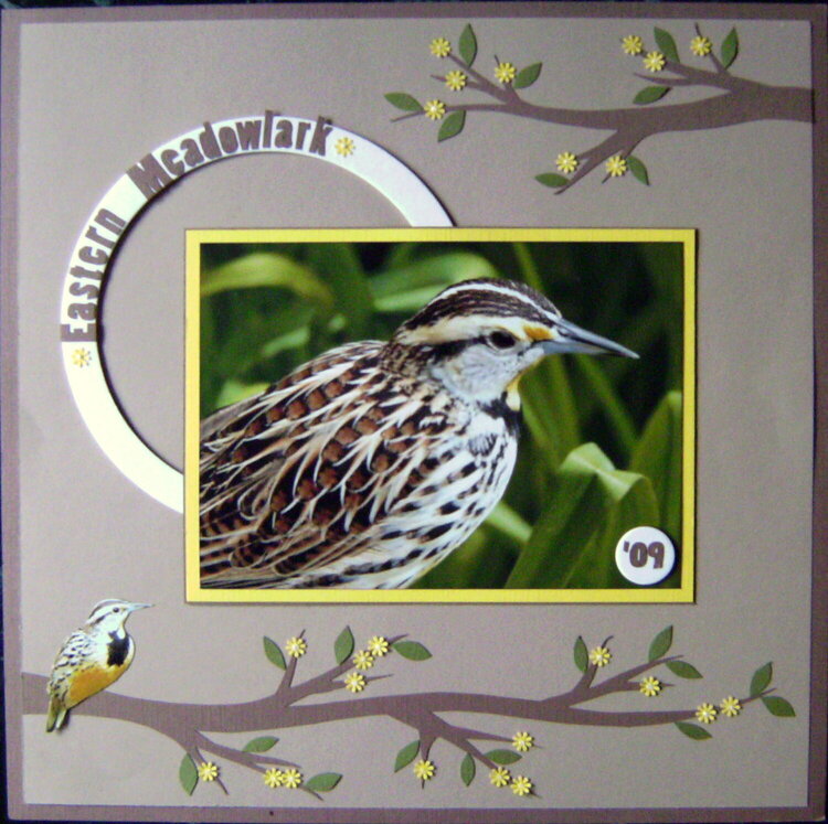
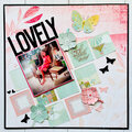
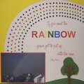
The branches/leaves are hand-cut, the flowers were punched and dotted with Stickles. The letters were a computer font that I printed and cut out. The small bird on the branch was cut from a photo.
Does this project or one of it's images contain pornography, profanity, or other illegal or offensive material? If so, please report it and our moderators will come by and clean it up in a flash.
November 01, 2009
October 19, 2009
October 19, 2009
October 18, 2009
October 17, 2009
October 13, 2009
October 09, 2009
October 08, 2009
October 08, 2009
October 07, 2009
October 07, 2009
October 07, 2009
October 07, 2009
October 07, 2009
October 07, 2009
October 07, 2009
October 07, 2009
October 07, 2009