

Livestream Party!
Join us today at 9:00am PT / 12:00pm ET | Details Here.
Join us today at 9:00am PT / 12:00pm ET | Details Here.

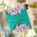
 Give a Cheer
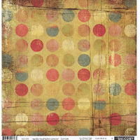
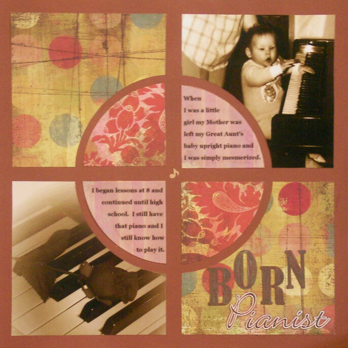
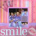
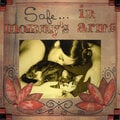
This is a LO i'm working on for my book of me. Not sure if it needs something else or what?
Just a note: This LO was very much inspired by EJTmum's LO Irresistible You


Thanks for spreading positivity!


July 06, 2007
May 10, 2007
March 05, 2007
February 06, 2007
February 06, 2007
January 11, 2007
January 10, 2007
January 10, 2007
January 10, 2007
January 10, 2007
January 10, 2007
January 10, 2007
January 10, 2007
January 10, 2007
January 10, 2007
January 10, 2007
January 10, 2007
January 10, 2007
January 10, 2007
January 10, 2007
January 10, 2007
January 10, 2007
January 10, 2007