Storage & Organization up to 60% OFF!
Plus, a FREE Gift! | Details Here.
Plus, a FREE Gift! | Details Here.

 Give a Cheer
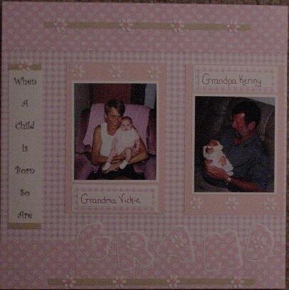
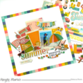
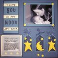
PAGE 1_Sorry for the horrible picture. I scraplifted most of this off a user on another website (sorry can't remember the user name). I'm having trouble lately with my titles blending into the pages too much, I'll definately have to work on that.
No products have been added to this project.

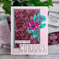
Thanks for spreading positivity!


January 20, 2004
October 26, 2003
October 27, 2002