


FREE Standard Shipping on Orders $69+ with code:
FREESHIPPING


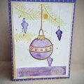
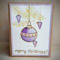
 Give a Cheer
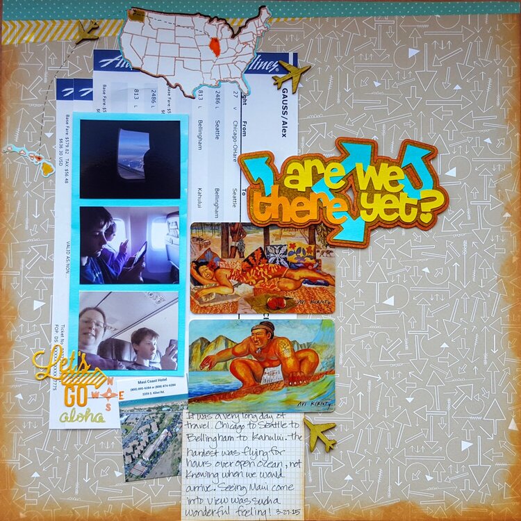
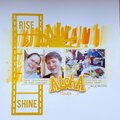
Documenting the long journey from Chicago to Maui for Spring Break.
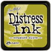
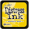
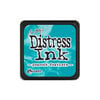
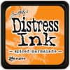
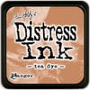
I used the Distress inks on watercolor paper to create coordinating die cut elements.
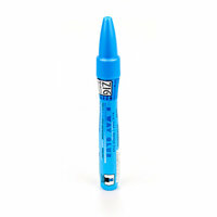
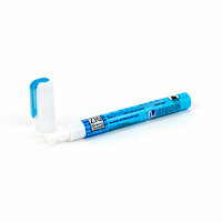
I used my Xyron Mega Runner, which is my go-to dry adhesive for the larger elements (holding the key cards for our hotel in place wonderfully) as well as Scotch Quick Dry for the wood veneer planes and Zig chisel and fine tip pens for the small die cut elements.
I used a wonderful sketch by Brenda Ragsdale for the page design.

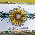
Thanks for spreading positivity!


December 07, 2016
January 11, 2016
November 23, 2015
November 21, 2015
November 21, 2015
November 15, 2015
November 14, 2015
November 11, 2015
November 11, 2015
November 10, 2015
November 10, 2015
November 10, 2015
November 10, 2015
November 10, 2015
November 10, 2015