


Storage & Organization up to 60% OFF!
Plus, a FREE Gift! | Details Here.
Plus, a FREE Gift! | Details Here.

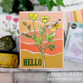
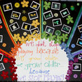
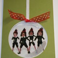
 Give a Cheer
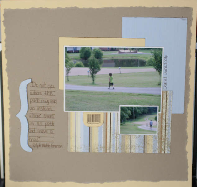
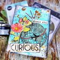
Journaling reads, "Do not go where the path may lead, go instead where there is no path and leave a trail." -Ralph Waldo Emerson


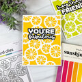

Thanks for spreading positivity!


June 23, 2007
June 23, 2007
June 23, 2007
June 21, 2007
June 21, 2007
May 23, 2007
May 22, 2007
May 21, 2007
May 21, 2007
May 20, 2007
May 20, 2007
May 19, 2007
May 19, 2007
May 19, 2007
May 19, 2007