Thank YOU! It's Customer Appreciation Week!
EXTRA 11% OFF Orders $100+ With Code: THANKYOU
EXTRA 11% OFF Orders $100+ With Code: THANKYOU

 Give a Cheer
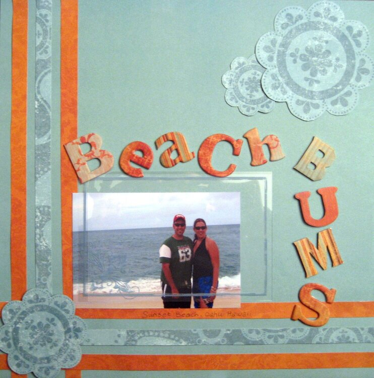
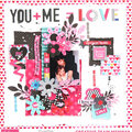
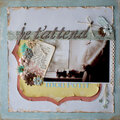
I'm quite pleased with this LO...although it looks alot better in person. I had some difficulty getting it to look right digitaly. There's some glare in the picture and the color of our skin is off. Oh well. I had gotten the idea from a LO that I'd seen in the community gallery. I find that the aqua and orange color combination works well and I love the Cosmo Cricket Chipboard letters. Very pleased. Thanks for looking!
No products have been added to this project.
Thanks for spreading positivity!


March 02, 2007
March 01, 2007