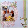
This is super ciool! Love the pps you used, but would bringmore of the pink from the pic ontop the desing, maybe on our journaling paper? Love the way you did the title too :)
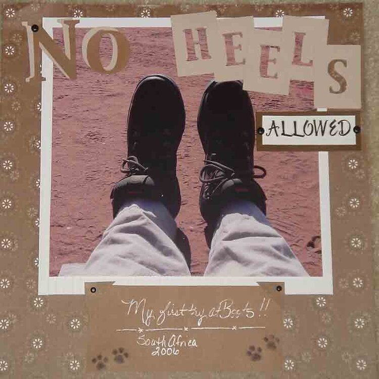
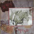
How fun - boots!!!!! I would love to see another color thrown in to liven things up! The b rowns tend to run into each other...and you can't quite see where the edges are. And i had trouble reading the journaling.
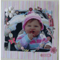
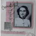
The journaling is difficult to read and I would love to know more about this. I think this layout has great potential though. I love the photo and the way you did your titile!
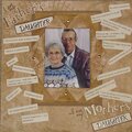
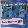
Cool picture! I like your paper choices and your title elements, but I think it needs some tweaking to give it some punch. For example, I like the white border around the pic, but it is kinda wide. Maybe trim it down a bit then mount it on a darker color mat to really help it pop. I also think many of the elements would look great with some inking. Finally, your journaling is a little difficult to read, so you may want to look at that. I think this has a lot of potential!
Does this project or one of it's images contain pornography, profanity, or other illegal or offensive material? If so, please report it and our moderators will come by and clean it up in a flash.


 Give a Cheer


April 08, 2007
April 02, 2007
March 31, 2007
March 29, 2007
March 28, 2007
March 28, 2007
March 28, 2007
March 27, 2007
March 27, 2007