I don't think I saw this one before even though it's in your Critique Group #3 album.. I do love the papers and pics you chose for this page, everything goes great together. I feel the ribbon across the top left photo is cutting it in pieces visually instead of accenting it.. I might like to see some more of that brown polka-dot ribbon running across the top of the page behind the top two pictures. Instead of running the ribbon down vertically on the pic, maybe wrap the ribbon around two opposing corners to accent the pic instead. I do think this page looks great and the title is wonderful, although I think I can tell that you used an upside-down W for your M on MOVE. :) heehee Great job!
Looks great to me. Maybe bring in osme of the ribbon inthe upper left corner - maybe stapled like on your tag but down the side of your upper left picture.
I like what you've done here,love the circles. Maybe if you wanted to add something try some ribbons from the edge of the pics. Just love the pics. You've got a cutie there.
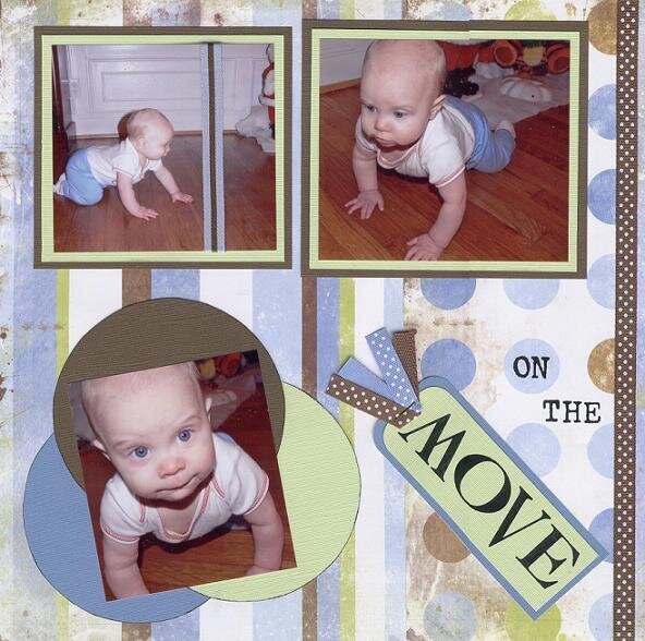
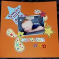
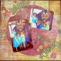
I made this LO yesterday at the LSS during NSD. It coordinates with a LO I made previously (Mr. Cheeks). It still looks like it needs something, but what?
Products Used: patterned papers - Karen Foster cardstock - DCVW textured cardstock ribbon - American Crafts rub ons - MM distressing ink
Does this project or one of it's images contain pornography, profanity, or other illegal or offensive material? If so, please report it and our moderators will come by and clean it up in a flash.
February 04, 2009
May 31, 2006
May 19, 2006
May 12, 2006
May 12, 2006
May 10, 2006
May 09, 2006
May 09, 2006
May 09, 2006
May 09, 2006
May 08, 2006
May 08, 2006
May 08, 2006
May 08, 2006
May 08, 2006
May 08, 2006