Livestream Party!
Join us today at 9:00am PT / 12:00pm ET | Details Here.
Join us today at 9:00am PT / 12:00pm ET | Details Here.

 Give a Cheer
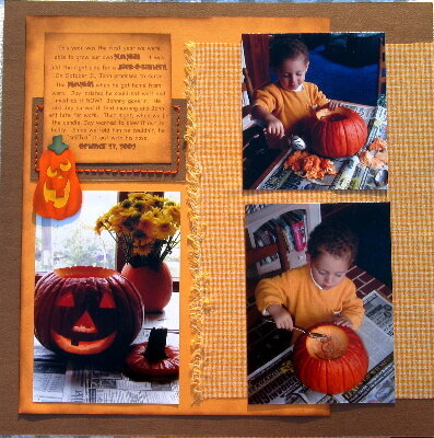
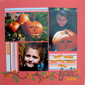
this is Jay's first pumpkin carving. It was from a pumpkin we grew in our garden. I am not sure I am crazy about the paper bliss pumpkin stuck to the page, I thought it detracted from the real pumpkin photo, but I thought it tied it to page 1 better. What do you think?
Paper bliss pumpkins
ornage dmc floss
gingahm fabric
gold c/s
brown bassill
brown ranger ink
fonts- chalkboard and
baby kruffy
No products have been added to this project.

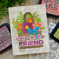

Thanks for spreading positivity!

%20-%20Scrapbook.com)


January 29, 2004
January 29, 2004
January 29, 2004
January 28, 2004
January 28, 2004
January 28, 2004
January 28, 2004
January 28, 2004
January 28, 2004
January 28, 2004
January 28, 2004
January 28, 2004
January 28, 2004
January 28, 2004
January 28, 2004
January 28, 2004
January 28, 2004
January 28, 2004