FREE Standard Shipping on Orders $69+ with code:
FREESHIPPING

Cheers
Give a Cheer

 Give a Cheer
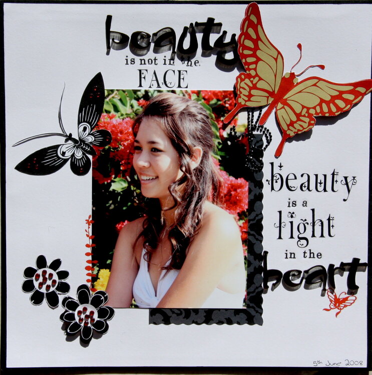
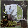
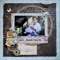
Unfortunately I kept getting shadows on the LO when I tried to take a picture (I don't know how to scan and stitch). The big red butterfly is on a transparency and it sits up really nice, but I had to try and lay it flat, and I'm not happy with the rubon letters I think I should have used smaller ones for the words beauty and light. All in all it's Ok, and it does actually look much better than the photo.
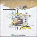
No products have been added to this project.

Thanks for spreading positivity!


March 20, 2009
November 16, 2008
September 07, 2008
September 06, 2008
September 05, 2008
August 28, 2008
July 05, 2008
July 03, 2008
June 27, 2008
June 23, 2008
June 20, 2008
June 16, 2008
June 16, 2008
June 14, 2008
June 14, 2008
June 14, 2008
June 14, 2008
June 14, 2008
June 14, 2008
June 14, 2008
June 14, 2008
June 14, 2008
June 14, 2008
June 14, 2008
June 14, 2008
June 14, 2008
June 14, 2008
June 14, 2008
June 13, 2008
June 13, 2008
June 13, 2008
June 13, 2008
June 13, 2008
June 13, 2008
June 13, 2008
June 13, 2008
June 13, 2008
June 13, 2008
June 13, 2008
June 13, 2008
June 13, 2008
June 13, 2008