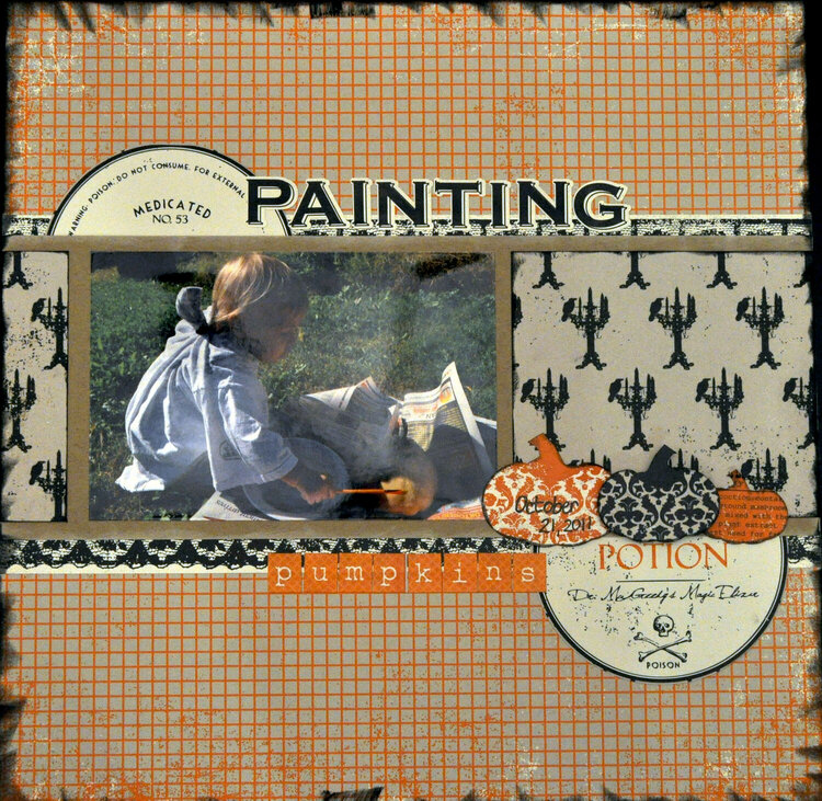
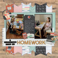
SHCG: This is a very cool pumpkin page. The choices you made have resulted in a very contemporary design. I just wish that the photo was larger. Sadly the last thing my eye goes to is the photo.
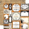
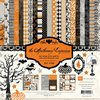
SHCG - What a gorgeous seasonal paper pack! I like how the semicircles create visual movement across the page. The black inking looks like you burned the edges, cool. I could see matting the photo in black for more emphasis but I really love this already as is!
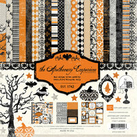
SHCG: I have really been eyeballing this collection and I like seeing how you've used it! I think it's great as is. My favorite part is how the circle embellies play off of each other. Great job!
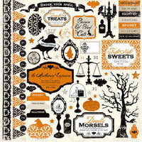
SHCG: Love all the layers and use of multiple pp. The inking adds so much to this LO. Great picture. I agree that a different color mat behind the picture might help it pop the picture out of the LO. Love the pumpkin trio and the poison additions. I like the title framing the picture. Looks like it was a fun LO to do.
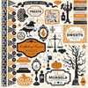
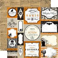
SHCG: I just love that paper pack, and I need to stop admiring it and finally use it like you have here. I like your selection of patterns, the different fonts and sizes for the title, and the poison labels. I might have used a more obvious purple or dark green for the photo mat, since there are enough neutrals. Still I like this as is, and I adore the pumpkin trio. It's awesome to see Joey entertaining his love for painting again.
Does this project or one of it's images contain pornography, profanity, or other illegal or offensive material? If so, please report it and our moderators will come by and clean it up in a flash.


 Give a Cheer


November 25, 2011
November 04, 2011
October 24, 2011
October 24, 2011
October 24, 2011
October 23, 2011
October 23, 2011
October 23, 2011
October 23, 2011