Storage & Organization up to 60% OFF!
Plus, Take an Extra 7% OFF With Code: STORAGE
Plus, Take an Extra 7% OFF With Code: STORAGE


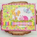
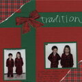
 Give a Cheer
Scrapworks PP
Bazill CS
I don't like the top part of the lo where the title is. Any suggestions?
No products have been added to this project.


Thanks for spreading positivity!
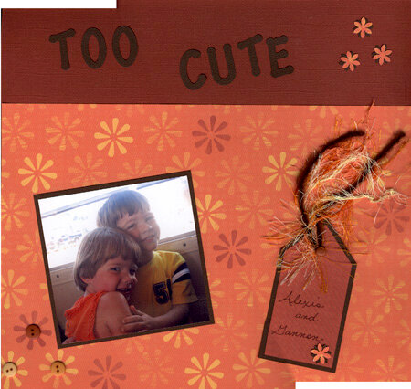


May 31, 2005
May 30, 2005
May 29, 2005
May 29, 2005
May 29, 2005