Mother's Day Weekend!
Take an extra 9% OFF with code: LOVE
Take an extra 9% OFF with code: LOVE


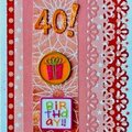
 Give a Cheer
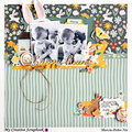
great grandpa and great granddaughter
No products have been added to this project.


Thanks for spreading positivity!


March 01, 2009
February 19, 2009
January 25, 2009
January 11, 2009
January 02, 2009
December 28, 2008
December 17, 2008
December 16, 2008
December 15, 2008
December 15, 2008
December 14, 2008
December 14, 2008
December 14, 2008
December 14, 2008
December 14, 2008
December 14, 2008
December 14, 2008
December 14, 2008
December 14, 2008