SHCG: I love the mosiac, such a cool affect. I agree with the others about the flowers and butterfly, I see the affect you were going for with the colored fonts and flowers/etc, but it'd be cool to see this with the fonts all the same and no embellishments, I think the mosiac would have more impact. :)
SHCG: I love the perspective from which this photo was taken, which is why I'd prefer to see less of it divided. For this photo, I would've only gone with the minimum requirement of three, and I either would've made by division among the three children, or one child into three parts. The only thing about dividing one subject into parts, though, is that it seems to set the one child apart from the others, and makes me wonder why the "special" treatment. As for the actual lines for the divisions, I would've continued the seaside theme and gone with soft wavy lines instead. I like how you chose to highlight three key words in your title by using different fonts and colors. However, since you already have "rainbow" in rainbow colors, I probably would've gone with a watery or darker blue for "faith." That said, I do wonder what the title has to do with three kids on the beach. In place of the butterfly and flowers, I can see a tag "tied" to the bottom of the pink strip with a little journaling that explains this, or at least their names, location, and year. That pink/blue digi pp bg is lovely with this photo. This is going to be a tough challenge for me, especially when it comes to cutting up photos.
SHCG - Very cool response to the challenge, Marsha! Marvelous mosaic & nice how the window concept conveys the idea of a "window wide upon in life", you know? I would like names & a date somewhere. Also, I think the flowers could work IF the colors were rainbow like the rainbow letters (the green & orange don't fit). If those flowers echoed the rainbow scheme, it would be more consistent & groovy! Overall, nice scrapping!
shcg: love the mosaic of the photo and how your highlighted specific words within your title. I have to agree about the butterflies and flowers not fitting the rest ofthe LO however. So pretty though!
SHCG: Love the way you highlighted part of your photo with the mosaic. I feel like the flowers are somewhat out of place, but otherwise this turned out great!!
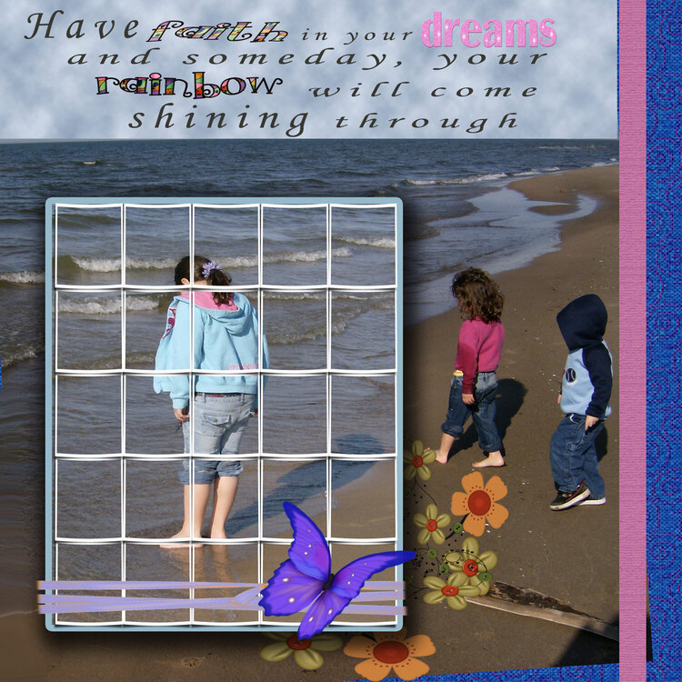
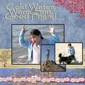
for bwc shcg. had a hard time with this one. the divided pic, the theme is from cinderella. the quote is from the song 'your dreams will come true' from 1950. and the layered embeleshments.
Does this project or one of it's images contain pornography, profanity, or other illegal or offensive material? If so, please report it and our moderators will come by and clean it up in a flash.
May 05, 2009
April 30, 2009
April 25, 2009
April 25, 2009
April 23, 2009
April 23, 2009
April 23, 2009
April 23, 2009
April 22, 2009
April 22, 2009