Thank YOU! It's Customer Appreciation Week!
EXTRA 11% OFF Orders $100+ With Code: THANKYOU
EXTRA 11% OFF Orders $100+ With Code: THANKYOU

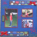
 Give a Cheer
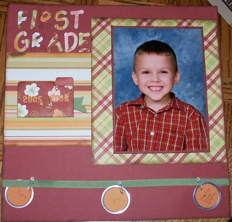
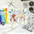
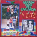
JOurnaling in file folder reads:
Yoiur teacher is Ms. Kramer who you have a big crush on! You have learned alot this year! Your biggiest accomplishment is learning to read. You are doing very well in school getting A's. Your best friend is Byron.
Tags read:
7yrs
A's
Reading, Math, spelling
No products have been added to this project.


Thanks for spreading positivity!


March 05, 2006
March 02, 2006
March 02, 2006
March 01, 2006
March 01, 2006
March 01, 2006
March 01, 2006
March 01, 2006
March 01, 2006
March 01, 2006
March 01, 2006