Storage & Organization up to 60% OFF!
Plus, a FREE Gift! | Details Here.
Plus, a FREE Gift! | Details Here.
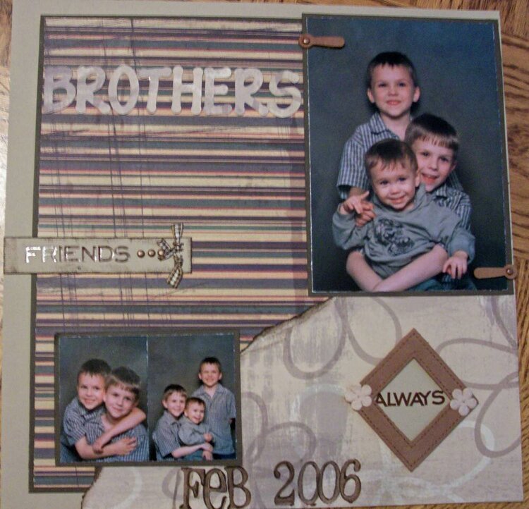

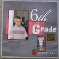
 Give a Cheer
reads:
Friends
Always
Feb. 2006
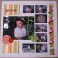
No products have been added to this project.


Thanks for spreading positivity!


March 11, 2006
March 08, 2006
March 08, 2006
March 05, 2006
March 05, 2006
March 05, 2006
March 03, 2006
March 03, 2006
March 02, 2006
March 02, 2006
March 02, 2006
March 02, 2006
March 02, 2006
March 02, 2006