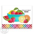
Livestream Party!
Join us today at 9:00am PT / 12:00pm ET | Details Here.
Join us today at 9:00am PT / 12:00pm ET | Details Here.

 Give a Cheer
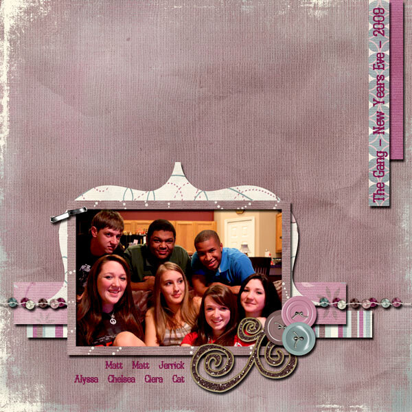
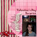
Chelsea and her friends on New Year's Eve. They are such good friends... but mostly they are such GOOD KIDS!!
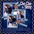
Paris in the Spring Kit by Amanda Dykan from DigitalCandy.us
Template from Fairytale Studios for the Candy Molds Challenge in January at DigitalCandy.us
LD Saloon Font
No products have been added to this project.


Thanks for spreading positivity!


March 12, 2009
March 01, 2009
February 19, 2009
February 02, 2009
February 02, 2009
January 27, 2009
January 25, 2009
January 18, 2009
January 16, 2009
January 16, 2009
January 15, 2009
January 14, 2009
January 13, 2009
January 12, 2009
January 12, 2009
January 11, 2009
January 11, 2009
January 11, 2009
January 10, 2009
January 10, 2009
January 10, 2009