Yes, I really like this lo, too, colors, fiber, journaling, etc. You might try adding another pattern or color of paper in the background. Like a corner of paper teared or a strip of a solid color on the top or bottom of the page-if you're still dissatisfied.
I just thought of this...what if you moved the lower left journaling over to the left to match up with the left edge of the picture above and in the new space, put 3 chinese letter stickers or some other Chinese embellishment going down?
But I think the lo looks great, especially when you look at the 2 pages together. P.S. The font is really neat! Just some ideas, I hope it helps. Thanks for sharing!
I really like the title on this page. It definately looks like something from a Chinese restaurant to me. You might want to trying matting the journal box in red too. I think you did a very nice job! I also like the colors that you used.
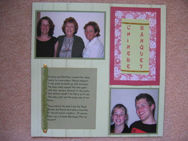
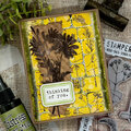
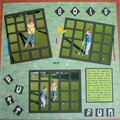
This is the left page of my layout, contaning the title and main journalling. I wanted to make the title look a little like a menu or something a chinese restaurant might have on a wall, so I used 2 strings of gold beads, with the beautiful Chinese brush type font. I didn't have all the different shades of green paper that I wanted, so the title itself if fully printed with the green and the red writing . The red floral is a scrap pack piece i had.
I really like this l/o but still feel vaguely dissatisfied. A little too rigid still? I don't quite know.
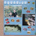
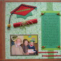
Does this project or one of it's images contain pornography, profanity, or other illegal or offensive material? If so, please report it and our moderators will come by and clean it up in a flash.
January 12, 2005
January 12, 2005
January 12, 2005
January 12, 2005