Storage & Organization up to 60% OFF!
Plus, a FREE Gift! | Details Here.
Plus, a FREE Gift! | Details Here.

 Give a Cheer
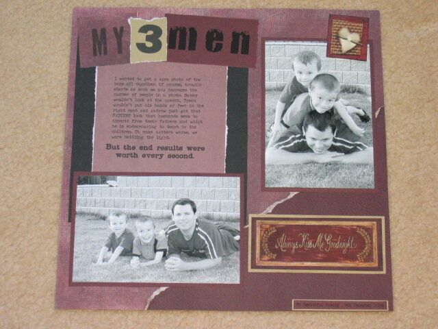
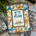
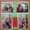
It's a bit hard to see from the photo, but the patterned paper background is full of printed texture - a mesh type print for the larger one, and the smaller one across the bottom right corner is leathergrain. Even the matting paper is very grainy as it is artists pastel paper. I've been using all the advice and things I'm learning from these boards, and I'm really happy with this layout. Could you improve it? I'd have liked to use some fibre but it seemed like overkill with all the texture and layers already in it. Any other ideas?
No products have been added to this project.
Thanks for spreading positivity!


February 07, 2005
January 22, 2005
January 21, 2005
January 18, 2005
January 17, 2005
January 17, 2005
January 17, 2005