Livestream Party!
Join us today at 9:00am PT / 12:00pm ET | Details Here.
Join us today at 9:00am PT / 12:00pm ET | Details Here.

 Give a Cheer
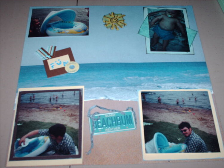
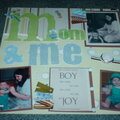
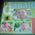
Donalds first trip to the beach! Pics of dad getting donalds floatie up.
No products have been added to this project.


Thanks for spreading positivity!


February 03, 2006
December 28, 2005
December 26, 2005
December 23, 2005
December 23, 2005
December 23, 2005
December 22, 2005