Ok I see this is version 2 .. well I like version one also.. loved the twined title.. this is brave of you to venture out.. I like this one too. Love the red border and the inking, the way the pics are dropped into the red color.. beautiful. I can easliy read the title and the tag.. great job..
I love this lo, and before noticing that others had commented or the before lo, I was thinking that it could use a bit of twine somewhere else. I absolutely love the tag and the inking!! Great job on the lo!
I like the addition as well. But I was also really liking the twine in the first layout. Maybe there is another way to incorporate the twine in this layout. Possibly anchor the title with it or attach the title with the date. Overall, I think your layout is very beautiful and I like the color combo!
love the addition of the pp at the top, although I hate that you took the twine off. I liked the way it looked, especially since you have the twine on your tag.
of course, it is still a gorgeous layout -- you are very talented.
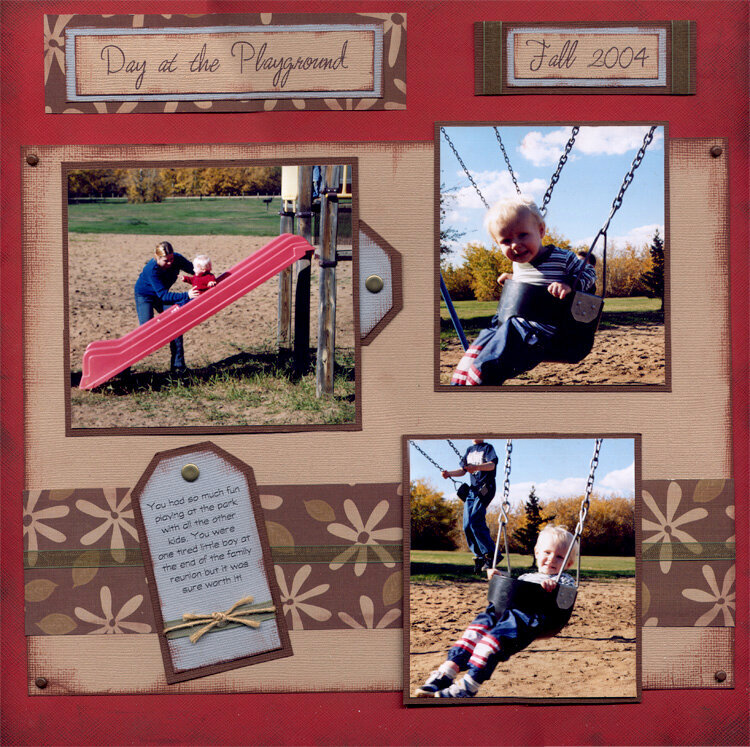
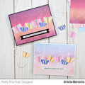
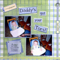
This is my revised version of this layout. Thank you all so much for your advice, I think that after I redid the title and added the patterned paper up top, it is much more balanced. What do you guys think?
Does this project or one of it's images contain pornography, profanity, or other illegal or offensive material? If so, please report it and our moderators will come by and clean it up in a flash.
April 20, 2005
March 24, 2005
March 23, 2005
March 22, 2005
March 22, 2005
March 21, 2005
March 21, 2005
March 21, 2005
March 21, 2005
March 21, 2005