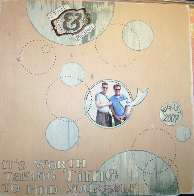
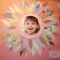
SHCG: i love this page's simplicity, the overlapping circles, and added doodling. My favorite part of the page, though, is how much their happiness shines through despite the photo's small size. I definitely think it needs to be bigger. I also have two other ideas to try. If you can't change the photo size, I'm wondering if you can help draw more attention to it by dropping their names to the doodled spot left of the photo. Then, i can see "It's worth taking time..." curved upward in the arc of the top semicircle and the remaining part of the title curved around the bottom semicircle. As is, I think your title appears bottom heavy and dominates the page.
SHCG - Love this. Awesome muted colors & circles. As Lisa said, love the floaty, dreamy quality. My only suggestion is to do one more thing to give emphasis to that great center pic. The arrow does that nicely but w/ the embellied title & flowy circles all around, I could see just one thing - maybe a bling circle around the pic? glitter on the arrow? - that draws more focus to the pic. Fabulous job!
SHCG: I like the circle theme! My only suggestion is to make the photo larger- closer to the size of the half circles- it seems a little lost on the page. Great LO!
SHCG: Very neat page. I would consider adding some embellishments with dimension though.. perhaps something circular just like the "bubbles" you have created in the background.
shcg: love the simplicity of the design. the circles provide enough embellishment to the page on their own and the quote/journaling is perfect. my only suggestion would be to tone down the size of the ampersand (&) because it overwhelms their names. nicely done!
Does this project or one of it's images contain pornography, profanity, or other illegal or offensive material? If so, please report it and our moderators will come by and clean it up in a flash.


 Give a Cheer


May 05, 2009
April 28, 2009
April 25, 2009
April 23, 2009
April 23, 2009
April 22, 2009
April 12, 2009
April 12, 2009