Livestream Party!
Join us today at 9:00am PT / 12:00pm ET | Details Here.
Join us today at 9:00am PT / 12:00pm ET | Details Here.


 Give a Cheer
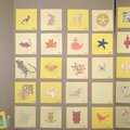
I'm stuck on this one. I like the direction it is going, but I'm not sure how complete it really is.
No products have been added to this project.


Thanks for spreading positivity!


August 30, 2009
August 22, 2009
August 16, 2009
August 12, 2009
August 09, 2009
August 07, 2009
August 07, 2009
August 06, 2009
August 03, 2009
August 03, 2009
July 31, 2009
July 31, 2009