Wow timewrinkler gave you a mighty big compliment..wow... I think that the layout as a whole is very cool. I love the shaded paint.. and all of the other elements.. here is my take.. the green is such a strong color how about balancing the green around the pic.. simply paint a mat in or use some cardstock... dont know but perhaps a bigger photo..maybe enlarge it.. just my humble opinion.. to my favs..
I think all the aspects of this layout are awesomely great!! With one wee exception: the value aspect. (Value=defined as the relative lightness or darkness of a color) These papers and photo are all in the same value. I think this may please your eye more if there were more defined areas of light and dark, particularly since the lettering is dark. Perhaps a darker mat, or a horizontal darker ribbon at the top edge of the horizontal strip of polkadot paper (just under the mat). Or--black inking around the current mat and along the edges of the polkadot papers. This may accent your dark lettering more, and give a more cohesive feel.
Also--just wanted to say--I've started my own personal list of those scrappers whose work I admire. And you are my newest addition! I love your work, because your layout designs are Different and Fresh! :up:
I really think this is a fun layout! I know how you feel with "hating" a layout. I just posted one that I'm not too fond of either. But I really think you did a great job. The layout concept portrays the picture well and it is nice and simple at the same time.
I love the colors of this LO. I think a darker photo mat would look great here and what about double or triple matting it to make the photo pop off the page a little? I also think a little ink on the edges would really add a little something. I love how you did the title - it looks very unique!!
Great layout. I love the colors -- the pp works great with it, but I agree that the picture gets lost. Like Becky said, maybe another mat or a different color mat that is darker and would draw the eyes into the picture.
I think it is really cooL!!! I love the painting---it completely rocks!!! I am thinking 1 of 2 things may make the pic stand out a bit more---either matting it in another color and then putting it on the bigger mat OR painting the edges of the pic? That said, it looks fab!!
I really like what you did with "friend"! I'm not sure how you did it, but it looks great. I did get a little dizzy feeling when I first looked at it, but that is exactly what a sit n spin does LOL. If you do think it looks too busy, you could try adding another solid color or solid ribbon. I'm not quite sure where you would put it, but it might break up some of the pattern. Overall, I think it is a very unique and colorful layout, good job!
I don't know why you hate it - I think it's great! Love the differnet techniques you used - the sanding and painting. I especially love how you did the title by painting around the letters - that has such a neat effect. The paper's also perfect for this lo! Great job!
Kathyy- I agree with you, there is a lot going on. initially I wanted it to be like that, cause that's how these kids are - busy and crazy! But i am just really unhappy with it. But it makes me feel better that you guys think it looks ok. I think i will try putting some paint or something on the flowers, good idea.
I like it the way it is, I love the papers that you used, very fun. However, I agree with Phamil above, you should "rub the metal eyelet flowers with pastel rub-on creme to lighten them up." Other than that, it's great. Good job-EMMA
I like that you have use a multitude of colors and textures. However I think it is a little to much because my eye goes away from the picture and more to everything else going on. The picture seems to get lost. The part I like best is how "friend" came out. The black with the green around it really is striking.
okay, I really don't know what you hate about this layout. It is so cute!!!! I LOVE the way you did "friend." Very cute and creative. Maybe if you were more specific about what you don't like we could give more suggestions??? ;)
But I love this and wish I had made it!
I don't know why you don't like it, it's really cute. I don't see anything wrong, the only thing I could think of would be to maybe rub the metal eyelet flowers with pastel rub-on creme to lighten them up, but I like them fine like they are. I'm not sure about this group thing, I'm pretty new to this site, so I hope it's okay to comment.
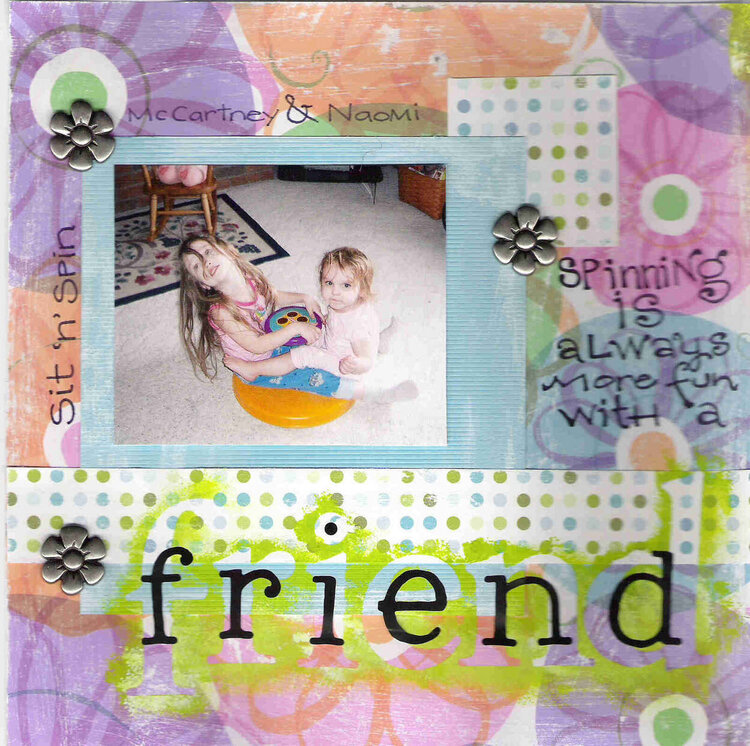
This is for critique group 4. Please tell me how i can improve this page - I really don't like it. I like how the sanding and paint turned out, but the page as a whole - I just hate it! Please help me.
Does this project or one of it's images contain pornography, profanity, or other illegal or offensive material? If so, please report it and our moderators will come by and clean it up in a flash.
June 24, 2005
April 20, 2005
April 07, 2005
March 20, 2005
March 14, 2005
March 13, 2005
March 13, 2005
March 13, 2005
March 13, 2005
March 13, 2005
March 13, 2005
March 13, 2005
March 13, 2005
March 13, 2005
March 13, 2005
March 13, 2005
March 13, 2005