FREE Standard Shipping on Orders $69+ with code:
FREESHIPPING

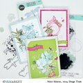
Cheers
Give a Cheer

 Give a Cheer
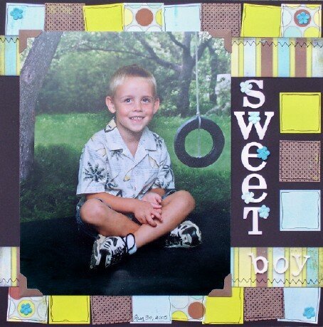
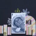
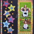
*JADS DT LO*
My ds last year. We had his picture taken Aug 30, 2005 and he was 4 years old here. Thanks for looking and have a super weekend!
~*DAWN*~
Products used:
cs
MME's Kaleidoscope pp's
Heidi Swapp Photo Corners
Heidi Swapp Chipboard Letters
Primas
StampCraft Ink-Black
Black Thread
Paper Studio Marquee Letters
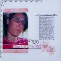
No products have been added to this project.

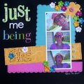
Thanks for spreading positivity!


December 12, 2006
December 03, 2006
November 27, 2006
November 22, 2006
November 21, 2006
November 20, 2006
November 20, 2006
November 20, 2006
November 19, 2006
November 18, 2006
November 17, 2006
November 17, 2006
November 17, 2006
November 17, 2006
November 17, 2006
November 17, 2006