FREE Standard Shipping on Orders $69+ with code:
FREESHIPPING


Cheers
Be the first to cheer this project!
Give a Cheer
Be the first to cheer this project!

 Give a Cheer
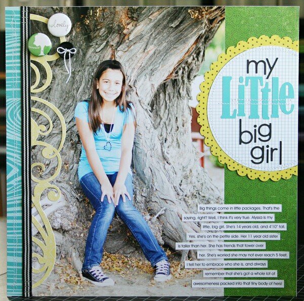
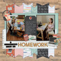
I was so excited to be asked to be a guest designer for the 2Peas Design School event this week! I was given the theme of “Proportion/Scale” for the focus of my project. When I think of proportion/scale, I think of the size of my elements on my layouts, and how they go together. Kind of like if I had a small tree element on my layout, I wouldn't want to put a gigantic flower next to it. One of the things that I tend to always keep larger in size on my layouts, are my titles. And I normally work with standard sized photos. So I thought it would be fun to use a HUGE photo on my page, along with a small title. I also wanted to do a little play on words, with my title, to fit my journaling.For this layout, I started with an 8x12 photo of my oldest daughter, Alyssa. Every now and then, it's fun to enlarge a favorite photo, and use it on a scrapbook page, really letting the photo shine! For my title, I did use some smaller letter stickers from Bella Blvd, but I also mixed in some larger stickers as well. I thought it added some interest to my title, to use larger letter stickers to spell the word “little”, but to use smaller letter stickers to spell the word “big”. I wanted to use the yellow scalloped edged circle paper for my journaling piece, but the inside part of the paper was a dark grey. I simply used my circle cutter, to cut out a large circle of the grid pattern paper, to cover that grey up. Thanks so much for looking, and joining me here at 2Peas for DESIGN SCHOOL!
No products have been added to this project.
Thanks for spreading positivity!