FREE Standard Shipping on Orders $69+ with code:
FREESHIPPING

Cheers
Give a Cheer

 Give a Cheer
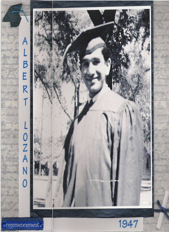
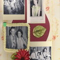
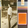
This isn't the best image, it is originally a 12x12 lo. This is my dad at his graduation. I re-printed the photo and made it 8x10. It is matted on a navy textured cardstock and double matted with a white textured cardstock. I used royal blue letter stickers and embellishments. His school colors were royal blue and white.
I added 4 white brads on the corners to help hold the pp down (it didn't want to stay) and used a 5th white brad to attach some hidden journaling that I really wanted to include but wasn't originally sure how! The journaling basically talks about my dad's love of learning and how he has inspired me in my life and taught me to love learning as well. (I didn't re-scan the image, it didn't seem necessary for such a small change)
No products have been added to this project.


Thanks for spreading positivity!


February 25, 2006
February 23, 2006
February 22, 2006
February 22, 2006
February 21, 2006
February 21, 2006
February 21, 2006
February 21, 2006
February 21, 2006
February 21, 2006
February 21, 2006
February 21, 2006
February 21, 2006
February 21, 2006
February 21, 2006
February 21, 2006
February 21, 2006
February 21, 2006
February 21, 2006
February 21, 2006