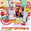
Wow - this is so pretty. My first thought was "what a beautiful woman!" and your journaling really proves that. I love the brad and the carton-packing detail underneath the journaling box. And I'm a sucker for those big flowers!
Tonya~ I'm loving what you're doing with heritage photos. Yes they are simple LOs, but that is a very good thing. You've got a nice touch -your LOs are so well arranged with good balance and well accented. Great job!
Thanks to all of you for your wonderful advice. I have made some modifications and this is the updated lo. I found the perfect shade of corrugated paper and used that to mat the journalling and changed the colored brads to a muted silver. I am really pleased with how this finished! Thanks again!
I love the pattern paper you chose for that gorgeous photo. The journaling is just beautiful as well. I like the idea of adding a mat and the brads -- ditto Meg on making sure they are softly colored brads to keep the focus on the photo. Beautiful page overall -- a lovely update for heritage pages. :)
I love the way you turned the argyle paper. The photo and journaling are awesome. I think I'm seeing a little pink down the sides of the journal box. I would have the mat all the way around. You could leave an extra length at the top and bottom and then trim it with antique edge sissors. I love the idea of using eyelets between the title and journaling. I'm not sure how much room you have, but 3 small pink square ones turned in the shape of a diamond (like the argyle) might work. I love the fabric covered brads in the center of the flowers, but so they patch the pink in the patterned paper? I would make sure all my accent peices are the same shade of pink. If the brads aren't, consider tying a matching piece of ribbon with a knot in the middle and securing it??? I agree with adjusting the angle of the tag. Maybe even moving it down a little and turning it totally horizontal and securing with brads on both sides. Silver brads might look nice here, if your pink does not match the paper. It looks like the dashed lines on the paper are grey and I love how your journally, the rim of the tag, and the edges of the flower also appear grey. Just wondering were you got those flowers?? PM me if you get a chance. Hope something here helps. Melisa
great Picture. very beautiful Lady. Love the soft color, choice of flowers, and I love the hint of red in the center of the flowers. I like the Journaling box unmatted but maybe if you raised it up on the page and put the tags overlapping the bottom of the Journaling Box slightly and overlapping the side of the photo slightly. And change the color of the tag brad to a more blendable green for balance. I really like all the softness, it showcases your photo. Wonderful Job.
I love the photo. The journaling is awesome, wish I had such pretty handwriting! If you add brads between the title and the journaling they need to be small and a really soft color, or I think it would catch the eye too much and distract from the overall impact of your page. Maybe just widening the mat a little? I think it's a great page just as it is.
This is just beautiful! Love the soft colors and the embellies you used. I, too, think the journaling strip needs to stand out more, maybe with a pink tone mat??? Love that you handwrote the tag, but I think it needs to be angled a bit more too; great work :)
I agree the journaling doesn't "pop" like I wanted it to. It is hard to see in the scan but it is double matted green on pink. I went that route because the pink didn't quite match but seemed complimentary. I will try it the other way around and I like the idea of the brads in the journaling, I hadn't thought of that! I will definitly do that! Thanks so much for all your advice ladies!
I love the use of colors. They really set the mood for the layout. Your journaling is nice, but could pop a bit more. I agree with matting it differently and perhaps even putting a row of 3 eyelets, brads... in between the journaling title and the actual journalling? Very nicely done.
I think this page is beautiful! The paper you chose and those flowers look awesome with that pretty picture. I don't think you need to change anything, unless you were to double mat the quote like some people said. Great job!
This is such a sweet tribute to your GM! I agree with Jasmine, matting the journaling would make it pop :) I love the way you handwrote the journaling, it gives it a personal touch. Maybe the tag could be written in black? to match the journaling.BTW, your GM was a very beautful woman and this picture captures that so well!!
This is so gorgeous! Your journaling is so heartfelt. Perhaps you could mat the journaling? Also, the vellum tag looks somewhat crooked, perhaps you can just slant it so that it's diagonal to the picture? I love the overall feel of this page! Great work! :D
I really like this. I am in the process of doing an album of my mother. She died 10 years ago and it has taken me this long to go thorugh all her pictures as I couldn't figure out how to do the album. I think I will do just one of her, and who she was. I really like the simpleness but yet elegance of you page.
Mary Sharp
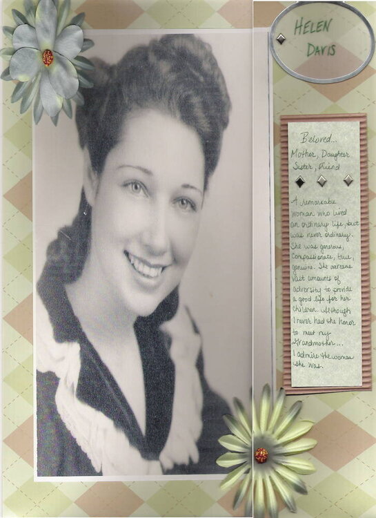
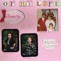
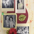
This was originally a 12x12 lo, so it didn't scan perfectly. I blew this photo of my grandmother up to 8x10 and used this pink/green argyle paper as the backdrop. I feel it helped to bring out the slight pinkish tone already present in the photo. I used silk flowers with fabric covered brads as an embellishment. The vellum tag in the corner has my grandmother's name written on it and is fastened by a brad. The journaling reads: Beloved... Mother, Daughter, Sister, Friend. A remarkable woman who lived an ordinary life but was never ordinary. She was generous, compassionate, true, genuine. She overcame vast hardships to provide a good life for her children. Although I never had the honor to meet my grandmother... I admire the woman she was.
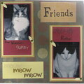
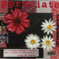
Does this project or one of it's images contain pornography, profanity, or other illegal or offensive material? If so, please report it and our moderators will come by and clean it up in a flash.
February 25, 2006
February 24, 2006
February 24, 2006
February 24, 2006
February 24, 2006
February 23, 2006
February 22, 2006
February 22, 2006
February 22, 2006
February 22, 2006
February 22, 2006
February 22, 2006
February 21, 2006
February 21, 2006
February 21, 2006
February 21, 2006
February 21, 2006
February 21, 2006
February 21, 2006
February 21, 2006
February 21, 2006
February 21, 2006
February 21, 2006
February 21, 2006
February 21, 2006
February 21, 2006
February 21, 2006
February 21, 2006
February 21, 2006
February 21, 2006
February 21, 2006
February 21, 2006
February 21, 2006
February 21, 2006
February 21, 2006
February 21, 2006
February 21, 2006
February 21, 2006