

Livestream Party!
Join us today at 9:00am PT / 12:00pm ET | Details Here.
Join us today at 9:00am PT / 12:00pm ET | Details Here.

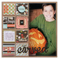
 Give a Cheer
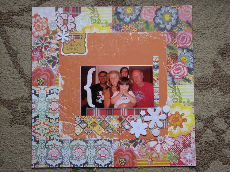
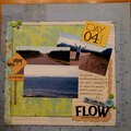
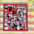
This one is a record! I made it in about 30 minutes! I'm trying to do a few quicker, simpler layouts lately. I actually scrapped onto the orange 8X8 paper thinking I would find a piece of white or light coloured background paper to make the layout really simple & minimal. I couldn't find anything I liked so I went with 4 pieces of 6X6 June Bug paper. So my layout went from minimalist to busy in about 30 seconds! I added the white chipboard flowers because it seemed like it needed embellies but it was already so busy, I didn't want them to get lost. My first instinct was that it needed some black... I went with white instead. I can't decided if I should have used some black embellies instead. There is a lot of white already in some of the paper. I know there is a space for a black (or white) thickers title, but so many of my layouts are like that, I thought I'd try something a little different. Now I'm not sure if it looks like I forgot a title! Any feedback would be appreciated. (I can take and appreciate constructive criticism!). I might rework this one over the weekend.
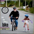
PS Olivia is my 4 year old... she was the photographer in this photo. We rarely get photos that include both myself and DH!

Thanks for spreading positivity!


October 16, 2009
September 28, 2009
September 27, 2009
September 27, 2009
September 27, 2009
September 27, 2009
September 27, 2009
September 27, 2009
September 26, 2009
September 26, 2009
September 26, 2009
September 26, 2009
September 26, 2009
September 25, 2009
September 25, 2009
September 25, 2009
September 25, 2009
September 25, 2009
September 25, 2009
September 25, 2009