FREE Standard Shipping on Orders $69+ with code:
FREESHIPPING

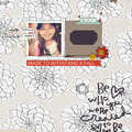
Cheers
Give a Cheer

 Give a Cheer
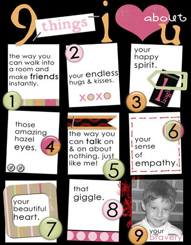
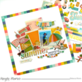
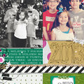
I made this lo as part of a challenge I'm running at Divine Digital.
This is the lo I lifted from:
http://www.scrapbook.com/scrapbook_layouts/showphoto.php/photo/175058
It's some of the things I love about my son, Josh....
Supplies:
All pieces created by me
TFL!!!
xo
No products have been added to this project.


Thanks for spreading positivity!


November 10, 2006
September 25, 2006
July 07, 2006
June 15, 2006
June 14, 2006
June 14, 2006
June 14, 2006
June 14, 2006
June 14, 2006
June 14, 2006
June 14, 2006
June 14, 2006
June 14, 2006
June 14, 2006
June 14, 2006