Mother's Day Weekend!
Take an extra 9% OFF with code: LOVE
Take an extra 9% OFF with code: LOVE

 Give a Cheer
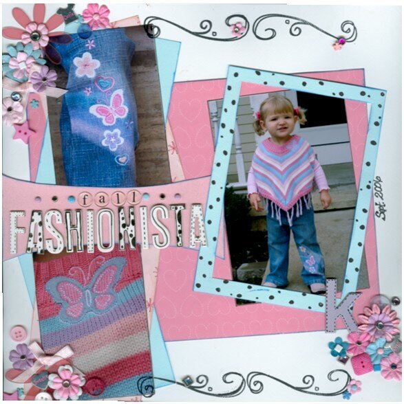
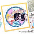
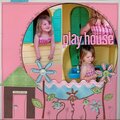
pp-(I used all scraps) all my memories
cs-bazzil
stamps-rhonna farrer-autumn leaves
prima flowers
heidi swapp ghost flower and chipboard letters
mm brads
buttons
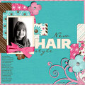
***this is Kennedy in the cutest outfit like ever! i wish I had this outfit!
No products have been added to this project.
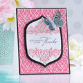
Thanks for spreading positivity!


November 03, 2006
November 02, 2006
October 06, 2006
October 05, 2006
September 29, 2006
September 24, 2006
September 23, 2006
September 22, 2006
September 22, 2006
September 22, 2006
September 22, 2006
September 22, 2006
September 21, 2006
September 21, 2006
September 21, 2006
September 21, 2006
September 21, 2006
September 21, 2006
September 21, 2006
September 21, 2006
September 20, 2006
September 20, 2006
September 20, 2006
September 20, 2006
September 20, 2006
September 20, 2006
September 20, 2006
September 20, 2006
September 20, 2006
September 20, 2006
September 20, 2006
September 20, 2006
September 20, 2006
September 20, 2006
September 20, 2006
September 20, 2006
September 20, 2006
September 20, 2006
September 20, 2006
September 20, 2006
September 20, 2006
September 19, 2006
September 19, 2006
September 19, 2006
September 19, 2006