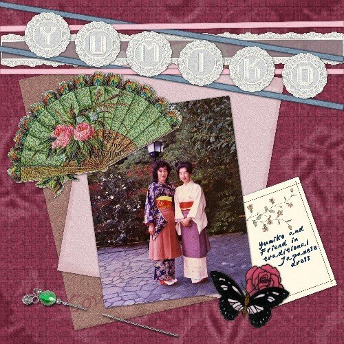
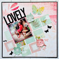
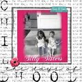
I mostly agree with what's been said. Consider removing the ribbon detail--you could go with a mimic of the women's obis or try for something that resembles rice paper. You may or may not know that apple blossoms are a big deal in Japan so they could be another element to try too...Japanese can be a tricky look to get across. All of this said, I like where this is going and really like your balance of the elements with the photo!
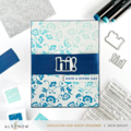
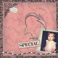
I like it. The elements you used are great. Especially like the stickpin. One thing that I would change is the alphas. I hardly noticed there were letters on them. I agree, they need some color.
I think the color scheme is off too. If it wasn't for the fact that one of the women is actually wearing a similar color I would say it is very unjapanese. I think if you re-tinted the burgundy background to red and the pinks to burgundy or better yellow, you'd still match the clothing, but get the asian feel. Love that stick pin. You might consider doing a coloration of the letters in the alpha as well to bring them out more.
You achieved the Japanese feel again, love the elements, butterfly, folwer etc. The only thing is, I think the color scheme is a bit off, maybe try to change the ribbon above from blue to purple or something like that, also the title dissapears, try to make it stand out, maybe by putting it against dark background...Love the pic, makes me want to go to Japan.
Does this project or one of it's images contain pornography, profanity, or other illegal or offensive material? If so, please report it and our moderators will come by and clean it up in a flash.


 Give a Cheer


March 01, 2007
March 01, 2007
February 27, 2007
February 27, 2007
February 27, 2007