I too am a fan of the color combination, it's not harsh to the eyes at all.
I do like both of them, but something about the Title color on the bottom one is appealing. I think it's the fact that it's a contrast to everything and therefore doesn't loose any of it's strength to similar colors...with the blue title your eyes keep traveling from title to border and back. I also like the positioning of the journaling...long and lazy is always better than short and quick, in my opinion. It just seems to me that the journaling on the bottom invites you to take your time poring over the page.
Beautiful work!
I love the color combination you used here. I think I like the bottom layout better too (although it is a tough call). I like that the journaling box turned that way looks like a recipe card and it looks like cooking in the pic. I also like the word Corazzos better in the burgundy color.
Fun lo! I like the bottom one better. I think I like that the word "Corazzas" is in the burgandy color instead of the blue. I also like your placement of hearts a little better on the bottom one than on the top. However, both lo's are really cute, and I love the pp and colors you used here. Great job.
Love it! And I prefer the bottom...it seems to be more balanced and fit the space better. The checkered paper makes me think of a tablecloth - perfect for the kitchen picture!
You've done a great job on both. However I think I prefer the bottom one. I keep scrolling up to take another peek to see why. The bottom lo is definately more pleasing to my eye & I think it's because the journaling rectangle is laid the same way as the pic, this is allowing it to flow more for me. I like it that the bottom title sits better above the journalling box. It's like it is supposed to be there. The top title kinda looks a little like it's floating?? - the bottom is making more of a statement for me. I love the stamped hearts at the bottom too, less blank space. I am adding this to my faves, you have such great idea's for lo's - TFS
I think this is so cute, Resa! I like the top one a bit better, I think it's only a matter of balance though. I LOVE your phot corner thingies! Those look awesome!!
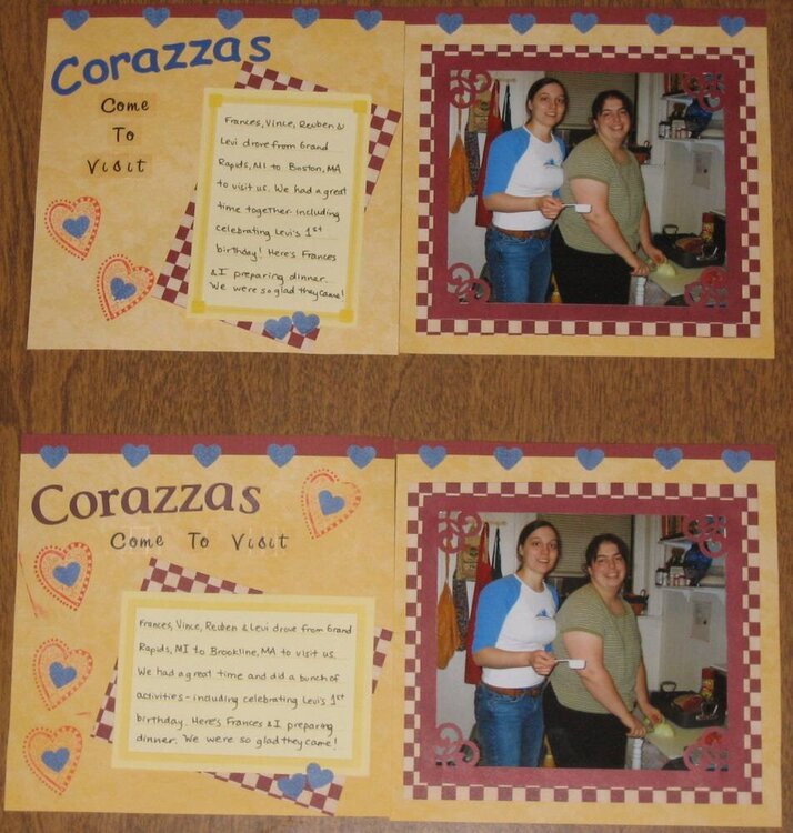
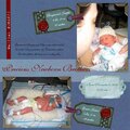
I did two versions of this page based upon not having duplicate supplies for the two copies of the page. I've included both copies and I'm curious which one you like better (and why). I'm not completely satisfied with this page (the stamping) but I didn't have quite the right color and I wasn't willing to buy a new stamp pad just for this page.
The PPs, journaling box, and I believe the "Corazzas" stickers are Creative Memories, the CS (strip along the top) is Bazill Basics Textured CS, heart punchies, rest of the title is alpha stickers from the dollar store.
Oh, and I just realized I forgot to put the date on it! I'll probably put it underneath the photo in the bottom right corner.
Does this project or one of it's images contain pornography, profanity, or other illegal or offensive material? If so, please report it and our moderators will come by and clean it up in a flash.
January 11, 2006
January 10, 2006
January 10, 2006
January 10, 2006
January 09, 2006
January 09, 2006
January 09, 2006
January 09, 2006
January 09, 2006
January 09, 2006