Livestream Party!
Join us today at 9:00am PT / 12:00pm ET | Details Here.
Join us today at 9:00am PT / 12:00pm ET | Details Here.

 Give a Cheer
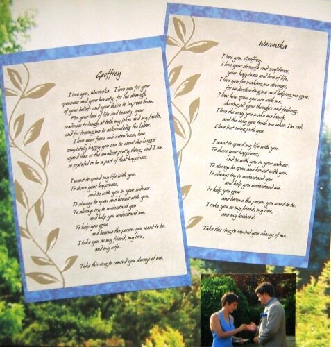
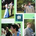
Our (non-)vows at our wedding ceremony. I like the general layout - I did a similar thing with all my ceremony cards (yes, this card over here was actually read from at my wedding), only changing the mat paper (I tried to get it to match the "mood" of the text) and the background (all of the backgrounds are taken from the view in the ceremony photos, but I chose different pieces for different LOs to contrast with the mat colors etc...)
The backgrounds were a little complicated: they're pieces of actual ceremony photos, and I really wanted them for backgrounds on my 12x12 pages, but I don't have a wide-format printer, and I didn't want them to be printed as photos, just as documents at draft quality to make them pale and blurry, so I couldn't use an online photo printing service. I ended up having to buy archival legal-size inkjet paper (not easy to find online!), print these in two halves, and then tear the halves and glue them together (I used tearing instead of straight trimming because torn lines are much less visible than straight ones). It worked pretty well.
It was sort of hard to squeeze two of these cards on one LO, especially with a mat, but I really wanted them to be together. Do you think they look OK? Also, I'm not sure about the little photo on the bottom... It has the ring exchange on it, so it sort of needs to be somewhere, but it's not a very good photo, so I want it small... But does it look silly down there? And, I have this bit of white space at the top - should I put something there? What? I'm avoiding any embellishments and even photo mats in the entire ceremony chapter to keep the attention on the cards, but sometimes it looks like I'm trying too hard.
No products have been added to this project.


Thanks for spreading positivity!

vows%20-%20Scrapbook.com)


May 25, 2006
May 21, 2006
May 19, 2006
May 19, 2006
May 19, 2006
May 19, 2006
May 18, 2006